Your sofa can feel warmer, richer, and far more personal with the right pillow design. These Fair Isle Knitting Patterns for Throw Pillows bring in soft wool texture, quiet Scottish color, and that cozy fireside mood many rooms miss.
Think cream against peat brown, heathered stripes, charcoal stags, and thistle borders that frame each cushion like a small work of art. The colors feel earthy and calm. The patterns add detail without making the room look busy.
In these 8 ideas, you will find pillow styles that help you dress up a plain chair, soften a leather sofa, or give a guest room a more collected look. Each one has its own charm, and each one makes you want to pick up your needles and start.
1. Peat and Cream Snowflake Pillow
A classic snowflake motif gives a square cushion that quiet Highland look, and it works best when you keep the color story simple and the shape clean. This design feels timeless because the contrast is clear, the pattern reads well from across the room, and the finished pillow suits almost any winter or cabin-inspired space.
Why this motif feels so calm
The beauty of a snowflake chart sits in its balance. You get strong geometry, soft symmetry, and a pattern that feels detailed without looking fussy. On a throw pillow, that matters. You want a design that catches the eye but still rests easily beside plaids, wool throws, or plain knit blankets.
A peat brown ground with cream motifs gives you that balance right away. The darker base feels grounded and warm, like weathered wood or moorland earth, and the cream floats brighten the surface without turning it stark. I like this pairing because it looks classic in daylight and even better in lamplight, when the contrast softens just a little.
Planning an easy 18-inch cover
An 18-inch pillow cover is a smart size for this pattern because it gives the snowflake enough room to show clearly. A square front panel lets you place one large central motif or a neat grid of smaller repeats, and both choices can look polished if your stitch count stays even. Keep a plain border of a few stitches around the chart so the motif does not feel cramped at the edges.
If you want the front to look crisp, swatch first and measure after blocking. Fair Isle knitting can pull in, and a pillow front that seems wide enough on the needles may shrink more than you expect. A little planning saves you from a cover that fights the insert instead of fitting it smoothly.
A back finish that looks thoughtful
A button-back finish suits this pillow especially well. It adds a handmade detail that matches the heritage feel of the snowflake motif, and it also makes the cover easy to remove. Small wood, horn-look, or matte cream buttons tend to fit the mood better than shiny ones.
Keep the back simpler than the front. A plain peat stockinette or ribbed overlap gives the pattern room to stand out, and the buttons become a quiet accent instead of another busy feature. That simple choice often makes the whole pillow look more expensive.

2. Heather Stripes With Small Stars
This version gives Fair Isle pillows a lighter, airier look. Narrow stripes and tiny star repeats bring movement to the fabric, and the effect feels fresh on a sofa that already has larger prints or heavier textures.
What makes this pattern softer
Small stars scattered through heathered stripes feel less formal than a large central motif. The eye moves across the pillow in a gentle way, which makes the cover feel relaxed and easy to mix with other cushions. If a full snowflake chart feels too bold for your room, this idea often lands in the sweet spot.
The striped layout also helps you control the scale. Thin bands can make the pillow feel longer and leaner, even on a square form, and they give you a natural place to shift colors without abrupt breaks. That is useful when you want variety but still want the front to look calm.
Choosing heathered yarn without losing contrast
Heathered yarn brings depth because each shade already holds more than one tone. A soft greyed plum, moss, oat, or weathered blue can look beautiful in a Scottish-inspired palette. Yet this is where many knitters run into trouble. If both colors are too close in value, the little stars disappear and the pattern turns muddy.
Set your yarn choices next to each other in natural light before you start. One color should clearly read darker, and the second should lift the motif with enough brightness. I often prefer a muted background with one cleaner, lighter contrast shade because the stars stay visible and the pillow still feels refined.
You should also think about texture. Fuzzy yarn can blur tiny motifs. A yarn with good stitch definition usually shows these small repeats better, especially when the pattern depends on neat little points and narrow bands.
Spacing stripe changes so the front looks balanced
Stripe changes need rhythm. If every band is the same width, the pillow can look stiff. If the widths change too often, the front can feel restless. A pleasing middle ground is to repeat a narrow stripe pattern for most of the pillow and then place a slightly deeper band near the center to anchor the stars.
Keep the star rows away from seams if you can. Tiny motifs placed too close to the edge often lose their shape when the pillow is stuffed. Give them some breathing room, and the whole cover looks cleaner once it is sewn and filled.
Where this design works best
This pillow shines in rooms that need pattern without heaviness. It works well on pale linen sofas, painted benches, and guest beds where you want a hint of Scottish charm without a dark winter palette. The striped look also pairs nicely with solid throws, brushed cotton, and simple ticking fabrics.
If you are making more than one cover, this is a strong companion piece. It can sit beside a bolder stag or snowflake pillow and soften the set. That mix keeps the arrangement interesting and stops every cushion from competing for attention.

3. Stag Motif for Cabin Style
A central stag chart gives a pillow a strong focal point and a more pictorial Scottish feel. This style has presence, so it suits a chair, bench, or bed where one cushion can carry the look instead of blending quietly into the background.
Using the stag as the star
The stag motif works because it tells a visual story. You are no longer working with only repeated geometry. You are placing an image at the center of the pillow, and that makes the cover feel more decorative and more rooted in cabin style. On a dark wool ground, the silhouette can look striking and still stay tasteful.
Chart placement matters a lot here. If the stag sits too high, the pillow can look off balance once it is stuffed. If it sits too low, the design feels crowded by the seam. Place the chart near the center and leave enough open space around it so the motif stands apart clearly.
Best colors for a grounded look
Charcoal and oat make an excellent pair for this pattern. Charcoal gives the pillow weight and depth, and oat softens the animal shape with a gentle, natural contrast. The result feels woodsy and calm rather than sharp or graphic.
You can warm the palette with a touch of rust, moss, or muted red in a narrow border if you want extra detail. Keep that accent restrained. The stag should stay the focus, and too many added shades can pull attention away from the central image.
When a plain back is the wiser choice
A plain back often serves this pillow better than a second pattern. The front already carries a strong motif, and a busy reverse side can make the cover feel overworked. A simple stockinette or ribbed back in charcoal keeps the finish neat and lets the front remain the hero.
This choice also makes the project easier to knit and assemble. If the front has long floats or detailed shaping in the chart area, giving yourself a simpler back saves time and reduces bulk at the seams. That matters on a pillow you will actually lean against.
How this pillow changes a room
The stag motif brings instant cabin character. Set it on a leather armchair, a plaid blanket chest, or a bed with flannel layers, and the room gains a clear focal point. It feels collected, not random.
I especially like this design in autumn and winter, but it does not have to stay seasonal. In neutral colors, it can work all year and still keep that quiet Highland spirit. That is the advantage of choosing a chart with strong shape and restrained color.

4. Thistle Border Around the Edges
A thistle border changes the whole mood of a Fair Isle pillow. Instead of covering the front with an allover repeat, you frame the panel with a floral edge, which gives the cushion a more graceful and tailored finish.
Why a border can feel more refined
Border patterns draw the eye outward, so the center of the pillow stays calm and open. That creates a lighter look than a fully patterned front, and it can suit rooms that already have a lot of texture. The pillow still feels Scottish, but the effect is more polished than rustic.
The thistle motif works especially well because it has shape and movement. Even in simplified Fair Isle form, the flower suggests heritage and place. You get symbolism, ornament, and structure all at once, yet the pillow still reads as practical home decor.
Measuring a clean frame
The frame must be even on all four sides or the whole design will look skewed. Measure your front panel carefully and decide how wide the border should sit before you cast on. A narrower band feels delicate, and a wider band looks bolder, but both need the corners to line up neatly.
Keep the center field plain or lightly textured so the border has room to shine. If the middle also carries a busy motif, the thistle edge loses its crisp framing effect. This is one of those times when restraint gives you more beauty.
Pairing the design with a zipper closure
A zipper closure suits this pillow better than a button band if you want a sharper, cleaner finish. Since the front has a decorative edge, the hidden opening keeps the back unobtrusive and modern. It also helps the cover sit flatter, which is useful when the border pattern needs straight lines to look its best.

5. Sea Glass Palette on Neutrals
Soft color, strong pattern
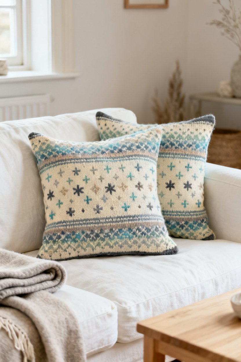
A sea glass palette gives Fair Isle Knitting Patterns for Throw Pillows a calmer mood without losing their Scottish charm. You still get the small repeats and rhythmic color changes that make Fair Isle special, but the feeling shifts from bold and rustic to light, airy, and relaxed. On an ivory base, shades of soft blue, misty green, sand, and weathered grey feel easy to live with, especially in a room that already has wood, linen, or pale walls.
This idea matters because color changes the whole message of a pillow. A high-contrast palette like black and white or peat and cream looks crisp and traditional, and it draws the eye from across the room. A gentler coastal mix sits back a little more. It blends into the space, then rewards you when you come closer and notice the detail in the motifs.
Why this look feels fresh
You may love Fair Isle pattern but feel unsure about strong color contrast on your sofa. That is where this approach works so well. The soft shades keep the surface busy in a pleasing way, not a loud one, so the pillow adds texture without taking over the room.
I also like this style for homes that mix old and new pieces. It pairs well with traditional wool blankets, but it also suits cleaner furniture lines and modern neutral rooms. The Scottish touch is still there, just expressed in a quieter voice.
If your yarn choices look too close in value, step back a few feet before you knit the full front. Colors that seem different in your hand can blend together from a distance. You want enough contrast for the motifs to show, yet not so much that the design loses that softened sea-worn effect.
A color plan that works
Start with ivory or warm cream as the ground, then choose one cool blue, one muted green, one light grey, and one sandy beige. Keep at least one shade a little darker than the others so the pattern has shape. Small stars, crosses, and tiny diamonds all work well here because they read clearly even in softer tones.
If you want the pillow to feel more Scottish than coastal, add a narrow band of slate or peat near the edges. That darker note frames the lighter center and stops the palette from feeling washed out. The result is gentle, polished, and very easy to save for later inspiration.
6. Mini Check Pattern for Beginners
An easy way in
A mini check pattern is one of the easiest Fair Isle Knitting Patterns for Throw Pillows to start with because the repeat is small and the rhythm becomes familiar fast. Instead of a large picture motif, you work tiny checks and simple diamonds that build neat structure across the cushion front. The look is classic, but the knitting feels manageable, which is exactly what many beginners need.
This kind of pattern helps you learn the basics without too much stress. You get practice carrying two colors, reading a chart, and seeing how repeated shapes line up from row to row. Since the design is compact, one small mistake usually does not throw off the whole project.
How to read the chart without panic
Begin at the bottom right corner of the chart if you are knitting in the round, or follow the chart directions row by row if you are working flat. Read one square as one stitch. I tell new knitters to ignore the full page at first and look at only one row, because that keeps your eyes calm and your hands steady.
Stitch markers help more than many people expect. Place one after each full repeat, especially if your chart has a short diamond inside a check pattern. Then you can count less, spot errors sooner, and avoid ripping back half the pillow front just because one motif drifted to the side.
The mistake that changes the fabric
The most common problem is pulling the carried yarn too tight across the back. Your colorwork looks tidy at first, but the pillow front starts to pucker, and the fabric loses its shape. A throw pillow needs enough body to hold form, yet it still has to lie flat.
To prevent that, spread the stitches on your right needle before you carry the unused color across. This gives the float enough length to sit comfortably behind the work. After a few rows, lay the fabric on your lap and check whether it curls inward at the pattern bands. If it does, relax your hands and try again before the tightness builds.
This design is a smart pick for your first colorwork cushion because it teaches control. By the time you finish, you will understand chart reading, repeat placement, and tension in a way that prepares you for more detailed Fair Isle pillows later on.
7. Nordic Pines With Deep Borders
Woodland mood with structure
Nordic pines give a Fair Isle throw pillow a winter woodland feel that still suits a Scottish-inspired room. Rows of simple pine shapes bring movement across the fabric, and deep border bands at the top and bottom anchor the design with weight and order. This is the kind of pillow that looks right at home beside dark wood, wool throws, and a chair near the fire.
The borders matter as much as the trees. A wide framing band in charcoal, forest green, or deep navy gives the eye a place to rest and makes the center motifs stand out more clearly. It also makes the cushion feel more finished, almost as if it has a woven frame built into the knitting itself.
Keeping the back neat
Pine motifs often create longer floats on the wrong side because the background color may run behind several stitches at once. If you leave those floats loose and untouched, they can snag when you add the pillow insert or when the cover gets regular use. If you pull them too tight, the front distorts. So you need a middle path.
Catch the float every few stitches when the gap gets long, but do it in a way that keeps the caught strand hidden on the front. I like to trap the yarn on the back after three to five stitches, depending on yarn weight and motif scale. This keeps the inside tidy and practical without making the surface look dotted or uneven.
Picking the right fiber
Pure wool has bounce, warmth, and a beautiful grip for colorwork, but it is not always the best choice for every pillow. A wool blend can work better if the cushion will get heavy daily use, especially on a family sofa where the cover may need more frequent washing and handling. A bit of alpaca adds softness, and a touch of synthetic fiber can help the shape hold over time.
I would still avoid anything too slippery for this design. Pine motifs look best when the stitches stay crisp and the dark borders remain sharp. If your room leans rustic, choose heathered shades. If your room feels cleaner and more modern, go for solid dark framing bands and a cooler background. Either way, the look feels grounded, calm, and deeply cozy.

8. Mixed Motif Sampler Cushion
A smart way to use leftovers
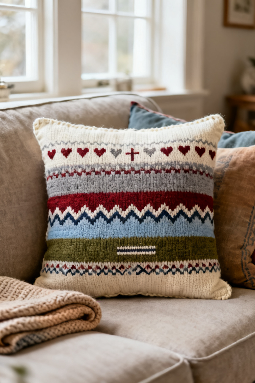
A mixed motif sampler cushion lets you stack several small Fair Isle patterns in bands, which makes it perfect for leftover yarn. Instead of repeating one motif across the whole front, you build the design in panels. That gives the pillow a collected, handmade look, and it also lets you play with color in smaller doses.
An easy layout might start with tiny hearts near the top, followed by a narrow cross pattern, then a wider chevron band through the center. You can finish with another small geometric stripe at the bottom to balance the front. The mix feels lively, but the panel structure keeps it organized, which matters when several motifs share one cushion.
How to join the bands well
You can knit the entire front as one piece and shift motifs as you move upward, or you can knit each panel as a separate strip and seam them together later. I prefer the first method when the yarn weight stays the same, because the fabric looks cleaner and the tension stays more even. Separate bands work well if you want stronger control over each motif or need to use very small yarn amounts.
If you do make separate strips, give each band a slim transition row in one shared color before joining. That small move helps the hearts, crosses, and chevrons feel related rather than random. Mattress stitch usually gives the neatest seam for pillow fronts, especially when the motifs sit close to the edges of each panel.
Keeping variety from turning messy
The trick is to repeat at least one color across every band. A cream ground or one steady accent shade can tie the whole sampler together. Without that thread of consistency, the pillow may start to look like scraps instead of a planned design.
This style suits knitters who like freedom. You can test a new motif, use treasured leftovers, and build a pillow that feels deeply personal. The finished cushion has the warmth of classic Fair Isle knitting, yet it tells a more playful story across the front.
Conclusion
The best Fair Isle throw pillows do more than fill a corner. They shape the mood of a room. A snowflake or stag motif brings strong tradition, while softer ideas like sea glass shades or a stacked sampler front let you bend that Scottish look to fit your own home.
If you want an easy place to begin, start with mini checks and learn to read a simple chart. If you have leftover yarn waiting in a basket, turn it into a sampler cushion with clear panel breaks and one shared color. Save the ideas that match your space, then knit one pillow first. Often, that single cover is all it takes to spark the next one.