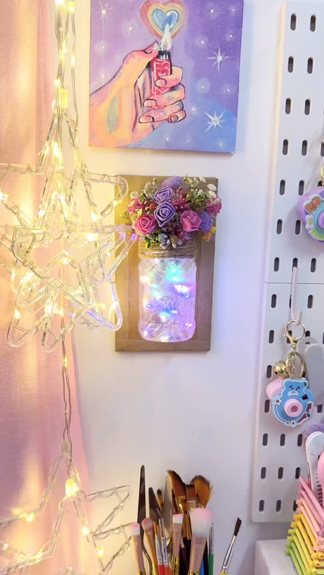
Blank walls can make a room feel cold, unfinished, and forgettable. The right DIY art changes that fast, adding color, texture, and a sense of calm without draining your budget.
Think soft linen in a frame, brushy paint on canvas, layered prints in thrifted wood frames, or yarn that catches the light and adds movement. These details make a space feel warmer, more personal, and far more styled.
These 10 ideas help you turn empty space into something beautiful and lived-in. If you want a home that feels cozy, polished, and fully yours, these simple wall art projects will give you plenty of inspiration.
1. Why DIY Wall Art Works
Empty walls often make a room look unfinished, even when the furniture is right and the colors work well together. DIY wall art helps you fix that problem in a personal way, because you choose the shape, tone, texture, and mood that fit your home. That sense of control is a big reason people keep coming back to handmade decor.
You do not need a huge budget or advanced art skills either. A few simple materials can bring in softness, contrast, and a clear focal point, and that shift can change how the whole room feels.
Personality shows up faster
Store-bought wall decor can look nice, but it often feels generic. When you make your own pieces, you bring in your taste right away, whether that means soft neutrals, bold black lines, muted earth tones, or playful shapes. Your walls stop feeling like blank background space and start telling a story about who you are and what you enjoy seeing every day.
This is where personality matters most. A handmade piece does more than fill a gap. It makes the room feel lived in, thoughtful, and real. Even a very simple project, like framed fabric or a painted canvas, can make a corner feel more complete than a mass-made print ever could.
Small cost, big visual change
Wall art covers a lot of visual space, so even one project can have a strong effect. That makes DIY art a smart choice if you want your room to look better without replacing furniture or buying expensive decor. A scarf, sample paint, leftover yarn, or printable art can go much further than you expect.
I have seen rooms shift from flat and plain to soft and inviting with just two framed pieces above a console table. The materials were cheap, but the result looked custom. That is the appeal. You spend less, yet your room feels more finished and intentional.
It softens a room
Blank walls can feel hard, especially in rooms with wood, metal, tile, or lots of straight lines. DIY art helps soften that effect. Fabric adds warmth, painted shapes bring movement, and fiber pieces create a gentle, relaxed feel that makes the room easier to settle into.
This matters in bedrooms, living rooms, and home offices, where atmosphere shapes your mood. A wall with texture and color feels calmer than a wall with nothing on it. You notice that change right away, even if you cannot explain it at first glance.
Credit to @atika_art_craft
2. Framed Fabric Panel Displays
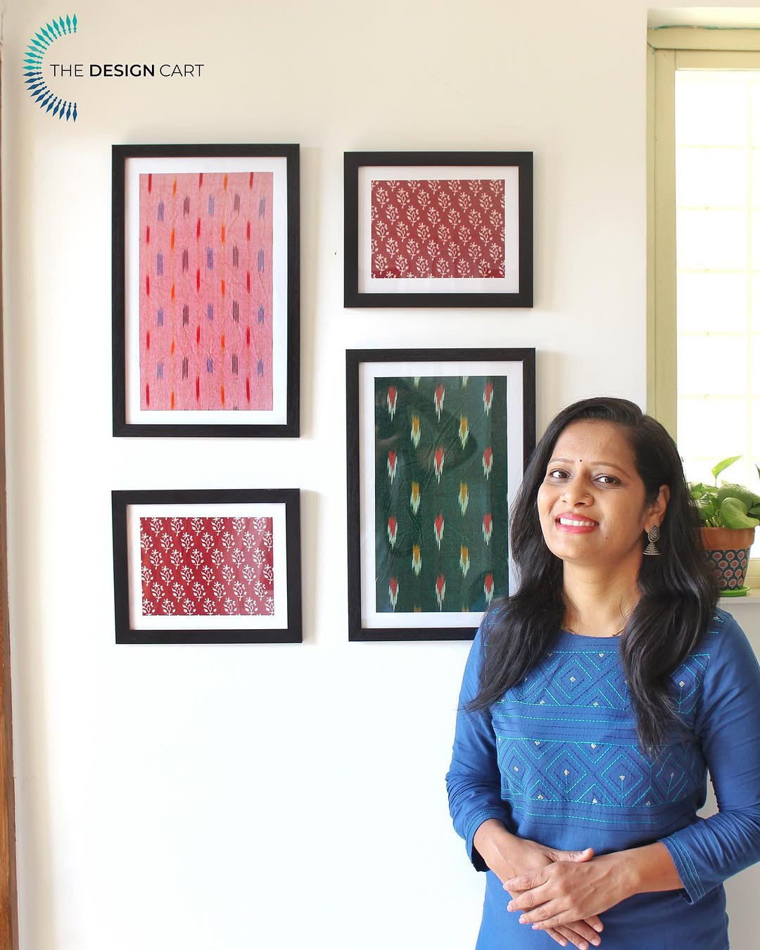
Framed fabric panels are one of the fastest ways to add color and texture to a blank wall. You can use fabric scraps, scarves, tea towels, or even old pillow covers to create art that looks polished and custom-made.
This idea works so well because the fabric already brings pattern and softness. Once you place it inside a frame, it feels more finished and much more expensive than the cost of the materials suggests.
Why fabric feels richer
Printed fabric has depth that paper often lacks. You get weave, folds, threads, and small shifts in color that catch the eye in a softer way than a flat poster. That is why framed fabric can make a room feel warmer almost at once, especially if your space has plain walls and clean-lined furniture.
You can go in many directions with this project. A faded floral scarf gives a romantic look. A striped linen scrap feels crisp and modern. A block-print cotton piece brings in a relaxed, collected mood. Because the choices are so broad, it is easy to match the style of your room instead of forcing your room to match the art.
Easy ways to make it look high-end
The frame matters just as much as the fabric. Thin black frames feel modern, light wood frames feel airy, and vintage gold frames add a softer, older look. If you want the display to feel calm and balanced, repeat one color from the fabric elsewhere in the room, such as in a pillow, throw, or vase.
Spacing also helps. A single oversized frame can anchor a wall above a bed or sofa, while two or three matching panels create a tidy, designed look. If you use patterned fabric, leave enough blank wall around it so the room does not feel busy. That breathing room helps the texture stand out.
A simple trick for better results
The smartest move is to pull the fabric tight before framing it. Loose fabric can sag and make the whole piece look rushed. Wrap it around a sheet of cardstock, foam board, or thin mat board first, then secure the back with tape or glue before placing it in the frame.
This step gives you a cleaner finish and keeps the pattern straight. It also helps the piece sit flat behind the glass, which makes your fabric panels look more like custom wall art and less like a quick craft project.
Credit to @myhomespeaks
3. Minimalist Painted Canvas Sets
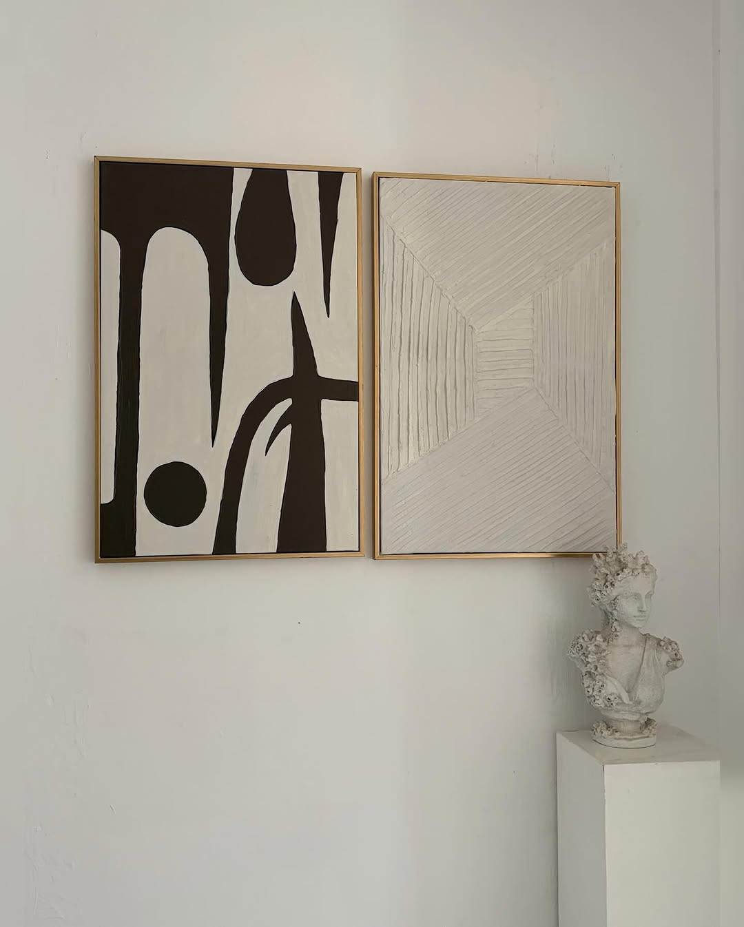
Minimalist painted canvas sets are a strong choice if you want modern wall art that feels calm, clean, and expensive. You only need basic supplies, but the final look can rival pieces you would find in a boutique home store.
These sets work best when the colors stay simple and the shapes feel intentional. A few brushstrokes, arches, blocks of color, or soft curved lines can create a lot of style without making the wall feel crowded.
Simple shapes, strong impact
Many people avoid painting because they think the art has to be detailed. It does not. In fact, the beauty of this style comes from restraint. A canvas with two earthy tones and one bold curve can feel more current than a busy painting with too many ideas competing at once.
If your room already has texture through rugs, baskets, or curtains, simple painted art brings balance. It gives the eye a place to rest. That is a big reason these sets work so well in bedrooms and living rooms where you want a peaceful mood.
How to make a set feel cohesive
The best canvas sets share something clear. That might be the same background color, the same shape repeated in different sizes, or one palette used across all pieces. When the canvases connect visually, the wall looks planned rather than random.
You do not need perfect symmetry, though. Two tall canvases beside one smaller square can look great if the colors and brush style match. I like to sketch rough layouts on paper first because it helps me see the group as one unit before I open the paint.
For a softer look, try warm white, sand, clay, olive, or charcoal. If you want contrast, add one deep accent like rust or black. Keep the palette tight. Too many colors can break the calm effect that makes this style so appealing.
Paint placement changes everything
Where you place the color matters as much as the color itself. If every shape sits in the center, the set can feel stiff. Let one brushstroke drift toward an edge, then place another low on the next canvas. That small variation creates movement and keeps the eye interested.
Your brush texture also adds character. Thick dry strokes feel more organic, while smoother blocks feel more modern. This is where minimalist canvas art stands out. It looks simple, but the details of spacing, color, and shape do the heavy lifting.
Credit to @golden_cityframes
4. Printable Gallery Wall Arrangements
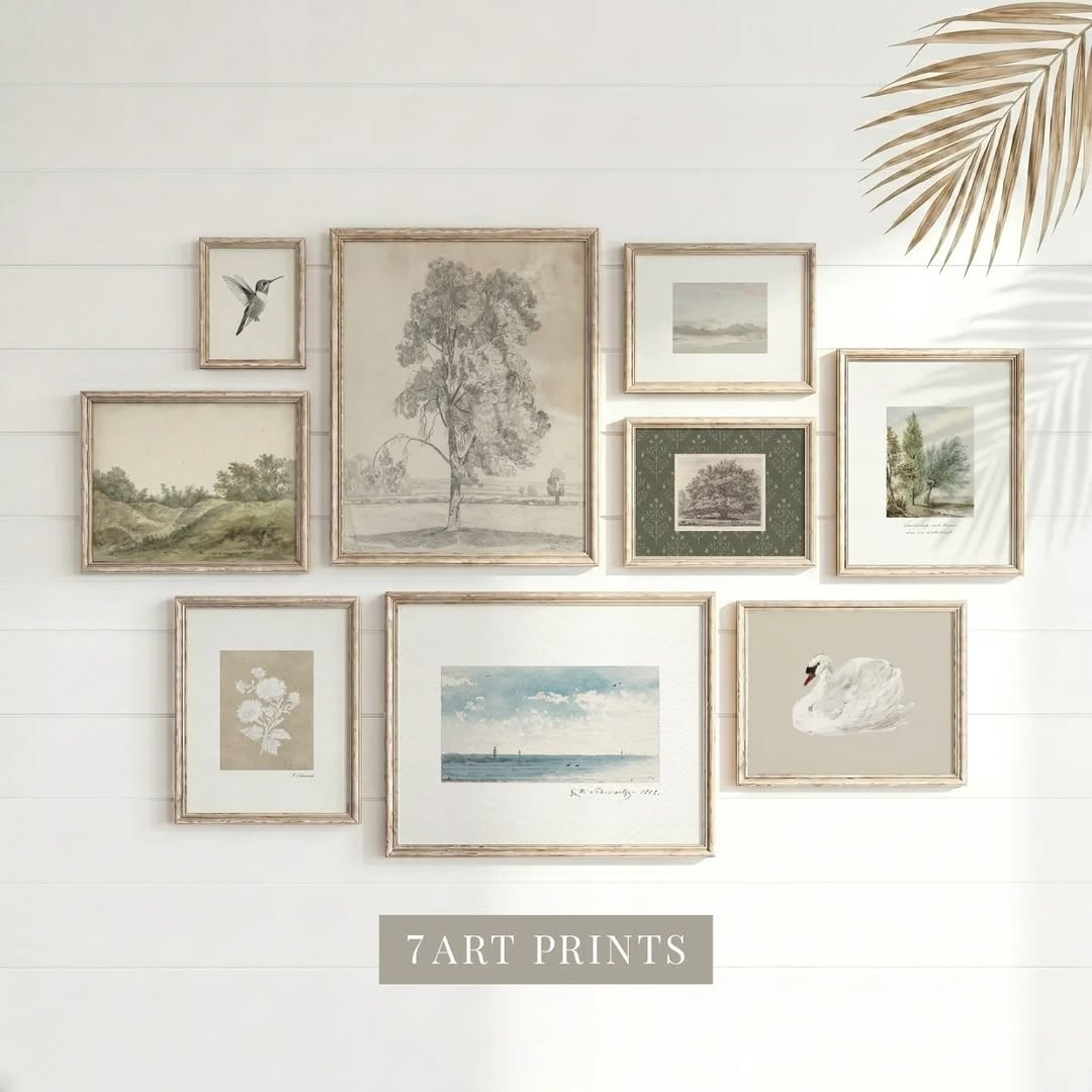
Printable gallery walls give you one of the cheapest ways to fill a large blank area with style. You can mix digital art, family photos, line drawings, typography, and thrifted frames to build a display that feels layered and personal.
This idea works especially well if you want flexibility. You can change prints by season, swap in new colors, or refresh the whole wall without replacing every frame.
Why this look feels collected
A good gallery wall feels like it came together over time, even if you finish it in one afternoon. The mix is what gives it charm. Thin black frames beside worn wood, abstract prints beside soft landscapes, and a small personal photo tucked between larger pieces all help the arrangement feel more human and less staged.
That sense of variety can warm up a room that feels flat or too neat. Blank walls often need visual rhythm, and a gallery wall creates that through repeated shapes and changing sizes. You get structure, but you also get life.
Spacing makes the wall look polished
The mistake most people make is hanging pieces too far apart. Large gaps can make even good art feel disconnected. Keep the spacing fairly consistent so the pieces read as one composition. Around two to three inches between frames often looks balanced, though larger walls can handle a bit more.
Start by laying everything on the floor first. Move pieces around until the weight feels even from side to side. If one frame is much darker or heavier, balance it with another strong piece across from it. You do not need a perfect grid. You just need a layout that feels steady when you step back and look at it.
Budget choices that still look stylish
Thrift stores, discount shops, and old frames from storage can save you a lot of money here. Paint mismatched frames the same color if you want a cleaner look, or leave them mixed if you like that layered, found feel. Printable art also gives you more freedom because you can test styles without spending much.
Try using a shared color story to hold everything together. Soft black, beige, sage, rust, and cream make a gallery wall feel calm. Brighter colors can work too, but it helps to repeat them across several prints so the mix feels intentional.
One choice that keeps it from looking messy
Pick one anchor piece first. This is usually the largest frame or the print with the strongest contrast. Place it slightly off center or in the middle, depending on the wall, then build around it. That single choice gives the display direction.
Without an anchor, a gallery wall can drift into clutter. With one, the rest of the arrangement falls into place much more easily, and the finished wall feels styled instead of crowded.
Credit to @7art_prints
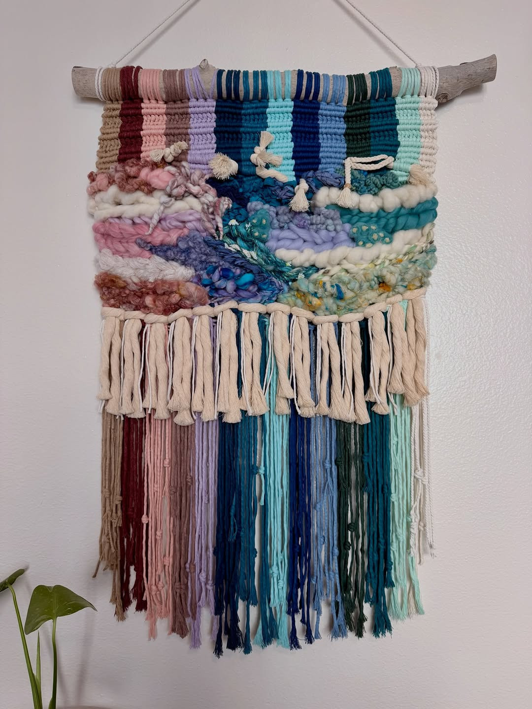
5. Textured Yarn and Macramé Pieces
Textured yarn and macramé pieces bring softness to walls in a way framed art cannot. They add movement, shadow, and a relaxed feel that works beautifully in bedrooms, reading nooks, nurseries, and quiet living spaces.
If your room looks clean but slightly cold, this kind of wall decor can fix that fast. The fibers catch light during the day and create gentle depth that makes the whole space feel warmer.
Soft texture changes the mood
There is something comforting about fiber art. The strands, knots, and loose edges make a wall feel less hard, which is helpful in rooms with painted drywall, metal lamps, or simple furniture. That softness can shift the whole mood of a space from plain to welcoming.
Macramé often suits a natural, airy style, especially with wood, linen, and plants. Yarn wall hangings can go in more directions. They can feel playful, earthy, modern, or muted depending on the colors you choose and how tightly the piece is arranged.
Size and placement matter more than you think
A small fiber piece can disappear on a large wall, so it helps to match the scale to the space. Above a bed, try a wider hanging with enough visual weight to hold the area. In a small corner, a narrow yarn piece can add detail without making the space feel busy.
Placement affects the mood too. If the hanging sits too high, it can feel disconnected from the furniture below it. Keep it low enough to relate to the room. That simple adjustment makes the art feel grounded, which is part of what gives handmade decor its calm, settled look.
Color keeps the piece useful
Neutral yarn and natural cotton are easy to live with because they blend into many color schemes. Cream, oatmeal, taupe, clay, and dusty rose can add warmth without taking over the room. If your home already has strong colors, a quiet fiber piece often works better than one with too many bright tones.
Credit to @soulcal.knots
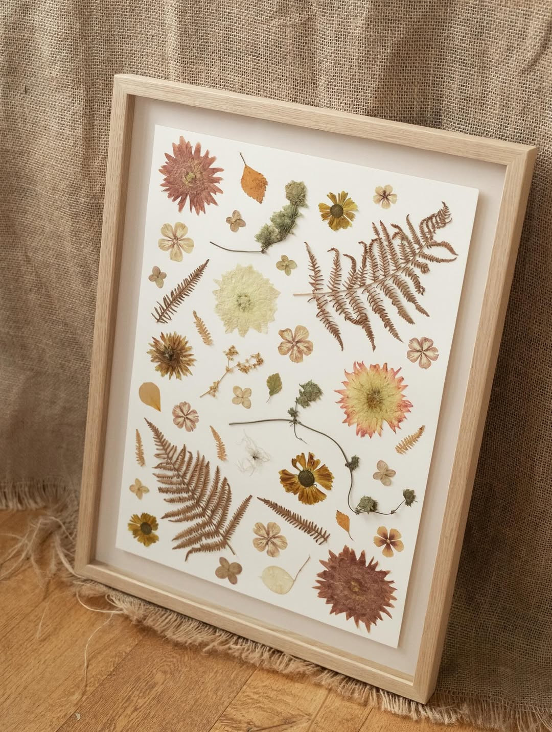
6. Pressed Botanicals in Frames
Pressed botanicals turn simple leaves and flowers into soft, natural wall art that feels calm and timeless. This idea works because it adds detail without making a room feel busy, and it gives blank walls a light, airy finish.
Why this look feels so fresh
Pressed flower art has a quiet kind of beauty. You can use ferns, wildflowers, eucalyptus, or even small branches from your yard, then place them in simple glass or wood frames for a clean, finished look. The result feels gentle and organic, which makes it a strong choice for bedrooms, entryways, and reading corners.
I like this style because it looks expensive without asking for much. You are working with natural shapes, so every piece already has movement and interest. Even one frame can soften a plain wall, and a small set of matching frames can create a peaceful focal point above a desk or dresser.
How to make it look intentional
The best pressed botanical displays keep the layout simple. Pick one plant type for a neat, minimal style, or mix a few shapes if you want the arrangement to feel more collected and personal. Thin black frames look modern, pale wood feels warm, and brass brings a vintage touch that still feels current on Pinterest and Instagram.
Spacing matters here. Leave room around each frame so the details of the leaves or petals stand out. If you crowd them too close, the art loses that light feeling that makes this idea so pretty in the first place.
Where it works best
This is a smart choice when you want wall art that does not compete with bold furniture or patterned bedding. It also helps if your room needs texture but you do not want heavy colors. In small homes, pressed botanicals can make a wall feel decorated without making the space feel closed in.
For the best result, press your plants fully before framing and choose paper with a little warmth, like off-white or cream. That soft background makes the greens and muted flower tones stand out, and your DIY art will look more polished from the start.
Credit to @hollygrows
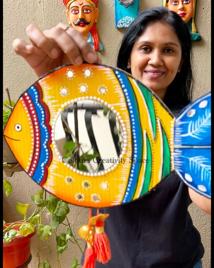
7. Statement Mirrors With DIY Flair
DIY mirrors do more than reflect light. They act like wall art, fill empty space with shape, and help a room feel brighter and more styled at the same time.
A plain mirror can do a lot
A mirror already brings function to a wall, but a few DIY updates can make it feel custom. You can paint the frame, wrap it with rope, add wood trim, or build a sunburst shape around a basic round mirror. That small change gives the piece more personality and helps it connect with the rest of your decor.
This idea is useful in spots where framed prints can feel flat. A mirror catches light during the day and adds depth at night, so the wall keeps changing as the room changes. That is why it works so well in entryways, dining spaces, and dark corners that need more life.
Easy ways to personalize the frame
If your style is clean and modern, a painted border in black, cream, olive, or terracotta can make a cheap mirror feel much more stylish. If you want something warmer, thin wood strips around the edge create a handmade look that still feels neat. Rope or raffia gives a softer, coastal feel, and it looks especially good with round mirrors.
You do not need to overdo it. One strong detail is often enough. A simple frame update can look better than a design with too many add-ons, especially if the mirror already has a nice shape.
How to place it like wall art
Think about a mirror the same way you would think about a large print. Give it enough room to stand out, and hang it at a height that reflects light or something beautiful in the room. If it reflects a blank corner, the effect will feel wasted. If it reflects a window, lamp, or plant, the whole space feels more alive.
I also like using a DIY mirror as part of a mixed wall arrangement. Pair it with two small art pieces or place it above a console with a vase and books below. That makes the wall feel styled on purpose, not just filled for the sake of filling it.
Credit to @colours_creativity_space
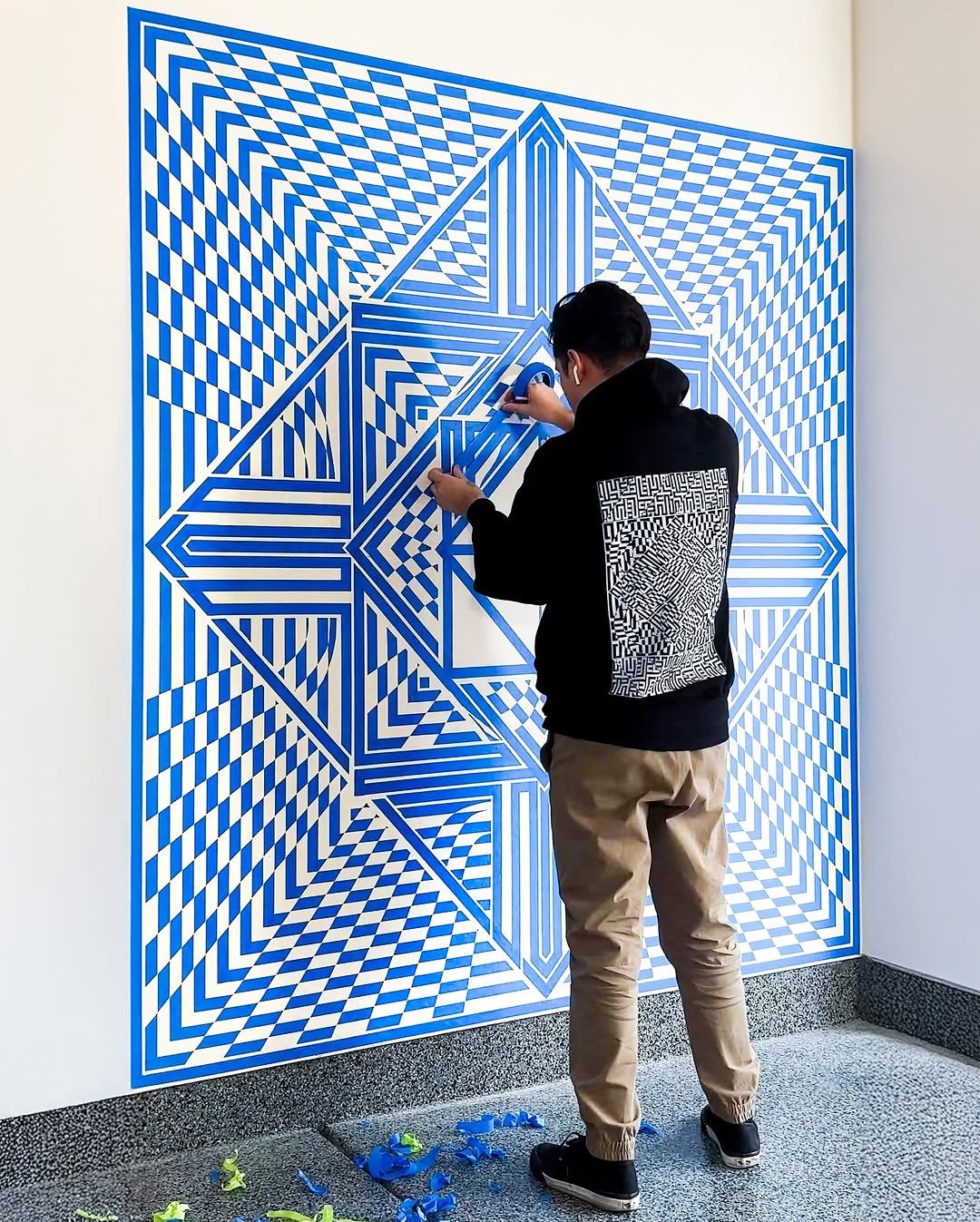
8. Tape Art for Clean Lines
Tape art uses painter’s tape to create sharp, geometric wall art that looks modern and neat. It is one of the easiest DIY ideas for blank walls because the tools are simple, the cost is low, and the finished result can look surprisingly polished.
Why clean shapes always work
Geometric art has strong visual order. Straight lines, color blocks, arches, and angled patterns make a wall feel more designed, which is helpful if the room needs structure. You do not have to be great at painting, either. The tape does most of the hard work for you.
This style fits many rooms because you can change the colors and scale. Soft beige and white feel quiet and minimal. Black with warm tan feels bold. Dusty pink with rust or sage can make the piece feel softer and more playful without losing that crisp, modern look.
Planning before you paint
The best tape art starts with a clear plan. Sketch your pattern first, then mark the main lines lightly so your design stays balanced. Large shapes usually look stronger than tiny ones, especially if the artwork will hang above a bed, sofa, or desk. Big forms read better from across the room and feel more confident on the wall.
It also helps to think about the frame before you begin. A white mat and slim frame can make even a simple painted design look more finished. If you want a casual look, you can paint directly on a canvas board instead.
Small mistakes to avoid
Paint can bleed under tape if you use too much at once. Use thin coats and let each one settle before adding more. Pull the tape off slowly while the paint is still slightly tacky, not fully dry, so your lines stay sharper.
I have found that limiting the palette makes a huge difference. Two or three colors are usually enough. Too many shades can make the piece feel busy, and tape art looks best when the shapes stay clear and the color story feels calm.
Where this idea shines
This is a great fix for first apartments, dorm rooms, home offices, and hallways that need bold art on a budget. It works especially well if you want something modern but do not want to buy oversized prints. With the right colors and a little patience, your DIY wall art can look like something you found in a boutique shop.
Credit to @_flekz_
9. Upcycled Objects as Wall Decor
Upcycled wall decor turns everyday items into art with texture, shape, and story. Baskets, trays, old frames, wood scraps, and even thrifted pieces can fill a blank wall in a way that feels layered and personal.
Why old objects make better art
Some of the most interesting walls do not come from matching store sets. They come from pieces with age, texture, or a little surprise. A woven basket can bring warmth. A vintage tray can add shine. An old shutter or cutting board can give a room that collected look people save again and again on Pinterest.
This approach works because it adds character fast. The wall feels less staged and more lived in, which is often the difference between a room that looks nice and a room that feels memorable. You are not just decorating. You are building a story with objects that already have shape and presence.
Mixing materials without making a mess
The easiest way to keep upcycled decor looking stylish is to repeat one thing across the group. That could be color, shape, tone, or texture. If you use baskets, trays, and wood pieces together, keep the palette warm and natural. If you use metal objects, repeat black, brass, or silver so the mix still feels tied together.
Size also matters more than people think. A cluster of very small thrifted objects can look scattered. Mixing one large piece with two or three medium ones gives the eye a place to land. Your wall will feel fuller and calmer at the same time.
Good places to hunt for pieces
Thrift stores, flea markets, yard sales, and your own closets are full of usable items. Look for shallow pieces that hang easily and have a strong outline. Round baskets are popular for a reason, since they break up the hard edges of furniture and frames, but square trays and old wooden pieces can do the same job in a more structured room.
If something looks dated, paint can help. Matte black can sharpen a tired frame, and soft white can give mixed objects a cleaner look. Keep some natural texture showing, though. That contrast is what makes this idea feel rich and real.
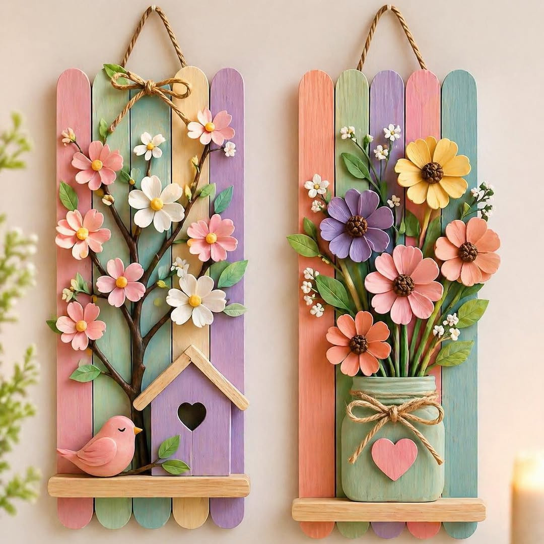
Credit to @juniorsartanddiy
10. Styling Tips for Cohesive Results
Cohesive styling is what makes DIY wall art feel polished instead of random. Good spacing, smart scale, and a clear color story help every piece look like it belongs, even when you mix flowers, mirrors, paint, and thrifted finds.
Start with scale and spacing
Many DIY projects look great on their own but feel off once they hit the wall. The usual problem is size. Small art on a big wall can disappear, and pieces hung too far apart lose their connection. Try to treat grouped items as one visual shape, then hang them close enough that they read as a set. In most rooms, a few inches between pieces looks balanced and easy on the eye.
You should also match the art to the furniture below it. Over a bed, sofa, or console, the arrangement should feel wide enough to relate to that piece. If it is too narrow, the wall can seem unfinished even when the art itself looks good.
Keep the color story steady
A room feels calmer when your DIY wall art repeats colors already in the space. Pull tones from your rug, pillows, curtains, or bedding, then echo those shades in small ways across the wall. You do not need perfect matches. You just need a thread that ties everything together.
I also like mixing one bold piece with quieter ones. That gives the eye a focal point and keeps the wall from feeling flat. If every item tries to be the star, the whole setup can feel noisy. A little restraint makes the final result look much more thoughtful.
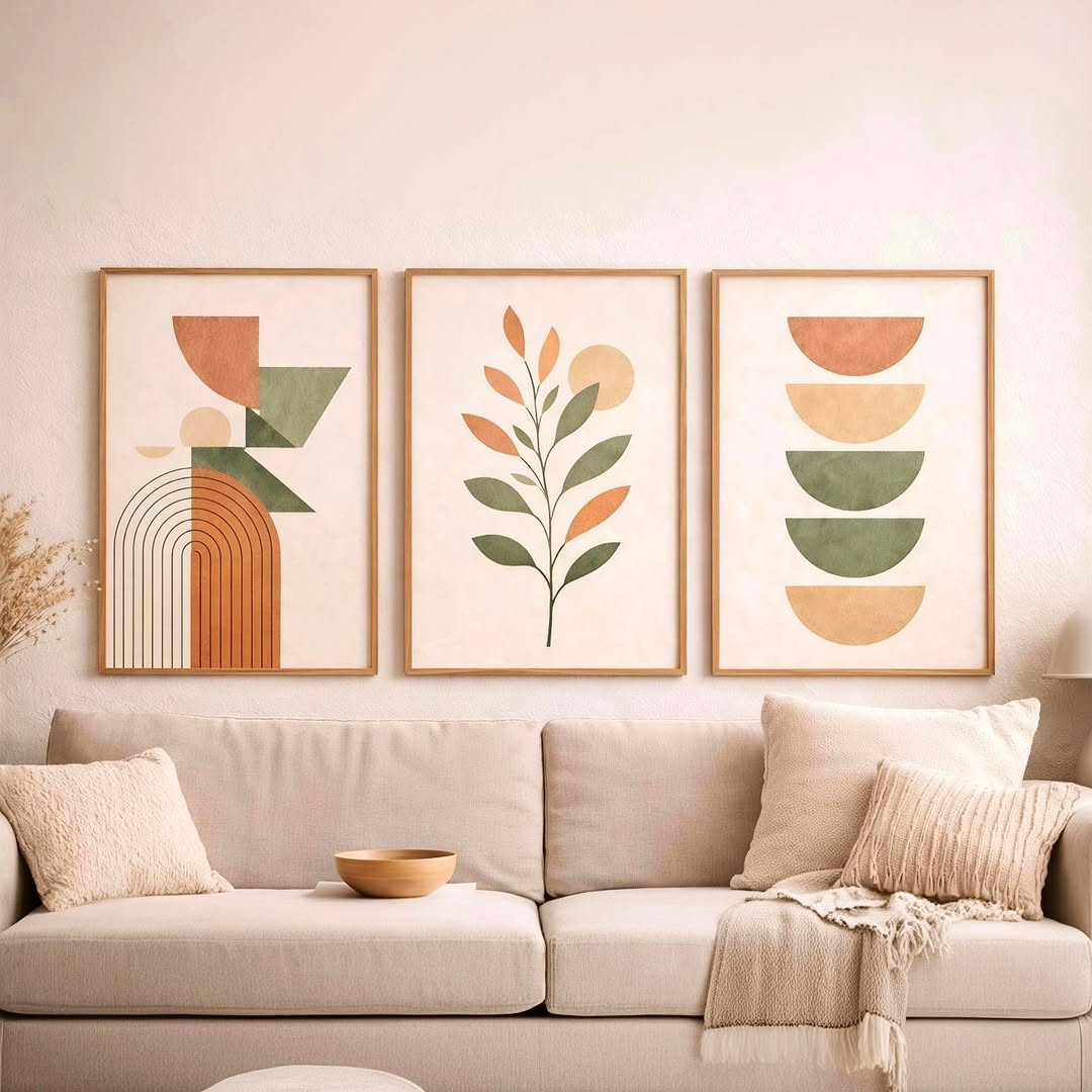
Credit to @leylartt_etsy
Conclusion
The best DIY wall art does more than fill space. It gives your home a point of view. Pressed leaves, painted lines, updated mirrors, and upcycled finds can all work beautifully when you pay attention to shape, color, and spacing.
Start with one wall and one idea that fits your room right now. Save the styles that speak to you, then build slowly. A blank wall can feel hard at first, but once you choose a direction, it gets much easier to create something personal and worth showing off.