You do not need fancy tools to make a card that feels personal, polished, and display-worthy. These 13 ideas help you turn paper, paint, thread, and tiny details into keepsakes that look thoughtful from the first glance.
Picture soft watercolor skies, pressed petals caught in paper frames, layered hearts in blush and cherry red, and neat stitched borders that add quiet texture. Each idea brings color, charm, and that handmade feel people remember.
If you want cards that look sweet, creative, and a little hard to part with, you are in the right place. These ideas make it easier to create something beautiful, even if you want a project that feels simple and calm.
1. Pressed Flower Window Cards
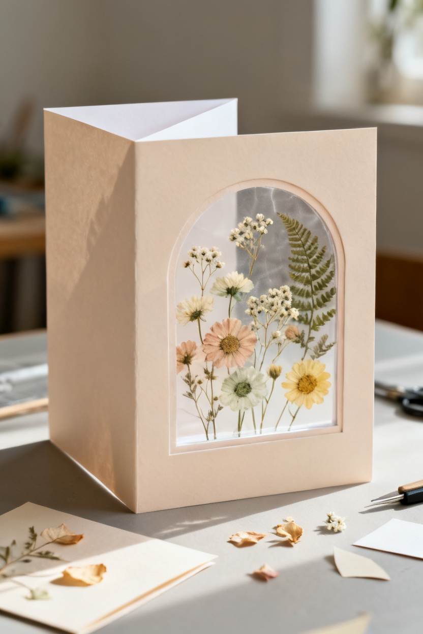
Pressed flower window cards frame real blooms inside cut paper openings, so the front of the card feels light, romantic, and almost like a tiny piece of wall art. They are lovely for birthdays, thank-you notes, and spring celebrations because they bring natural color and a soft handmade look without needing a lot of extra decoration.
You can make this style with cardstock, clear acetate or tracing paper, and a few flat dried flowers. The result feels delicate, but the design is simple enough that you can finish it in one quiet afternoon.
A soft frame with real charm
The beauty of this card comes from contrast. You have a clean paper frame on the outside, then inside the window you see thin petals, tiny stems, and muted colors that look almost weightless. That mix makes the card feel more special than a standard floral print because every bloom has its own shape.
If you love projects that look expensive but stay easy to build, this one does that well. A circle, arch, or heart-shaped cutout gives you structure, and the flowers do the rest of the work. I like using small daisies, fern pieces, and baby’s breath because they sit flat and still show detail through the window.
This design also gives you room to keep the rest of the card quiet. A simple greeting in one corner, soft cream paper, or a pale blush background is often enough. Too many extra details can fight with the flowers, so restraint helps the card feel fresh and calm.
Picking flowers that press well
Not every bloom works the same way, and that matters. Thick flowers can leave bumps and moisture marks, while flatter blooms keep the card neat and easier to glue. Small petals usually hold their color better too, especially if you dry them out of direct sun.
You can press flowers between heavy books, inside a flower press, or between sheets of paper under a box. Give them enough time. If they still feel cool or soft, they are not ready. Once dry, store them in a flat envelope until you are ready to make your card.
How to keep it neat
The cleanest version uses a back layer behind the window so the flowers stay protected. You can place the blooms on a plain insert, then cover them with acetate or vell vellum-style tracing paper before attaching the frame. That way, the front stays smooth and the flowers are less likely to catch on fingers or bend in the mail.
Spacing matters more than people think. Leave a little air around each flower instead of filling every inch. That open space lets each bloom stand out and gives the whole card an airy, graceful look that feels easy on the eyes.
2. Watercolor Wash Birthday Notes
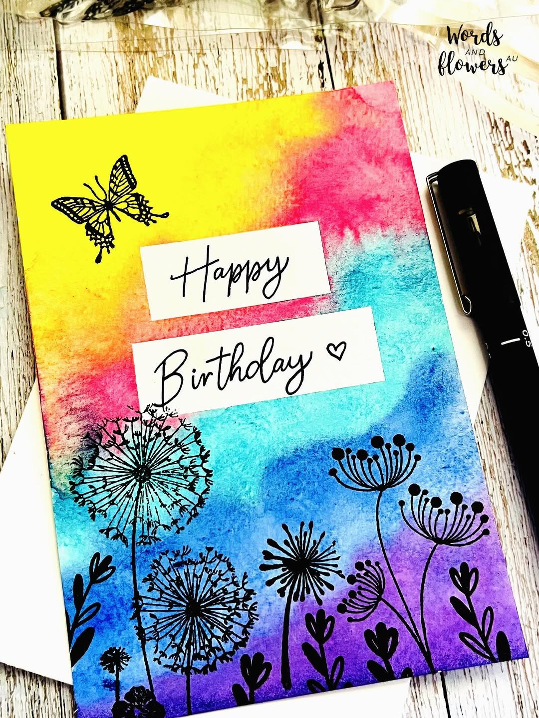
Watercolor wash birthday notes use soft blended paint as the main decoration, then add simple words and a few careful details on top. They feel calm, artistic, and warm, which makes them perfect when you want a birthday card that looks handmade without looking busy.
This style is great if you enjoy color but do not want to draw complex pictures. A loose wash can carry the whole design, and even beginner-level painting often looks beautiful once it dries.
Color that does the heavy lifting
A watercolor wash gives you instant mood. Peach and pink feel cheerful, dusty blue feels peaceful, and a blend of lilac and gold can look dreamy and a little grown-up. Because the paint spreads softly across the paper, the card feels relaxed instead of stiff.
You do not need perfect brush control for this to work. In fact, a little uneven blending often adds to the charm. If the edges fade naturally and one part of the color looks deeper than another, the card starts to feel personal in the best way.
I have found that simple washes often beat detailed painted scenes for birthday cards. They dry faster, they leave more room for lettering, and they still feel thoughtful because the hand-painted color is the focus.
Lettering that stays clean
Once the wash is dry, the words matter. A short message like “Happy Birthday,” “Celebrate You,” or just the person’s name in the center keeps the design balanced. Black ink gives crisp contrast, white gel pen looks lovely on darker paint, and metallic ink adds a little shine without making the card feel loud.
Placement can change the whole mood. Centered lettering feels classic, off-center text feels modern, and a tiny message near the bottom leaves the paint to speak for itself. If your handwriting feels shaky, lightly sketch the line first in pencil and erase it after the ink dries.
Small details that finish it
This type of card only needs one or two extra touches. A thin gold splatter, a tiny painted dot border, or one pressed star shape can make the front feel complete. More than that can crowd the soft wash and take away its easy beauty.
Paper choice helps a lot here. Thick cardstock keeps the water from buckling too much, and a slight texture makes the paint settle in a lovely way. If you want a smoother look, tape the edges before painting so you get a neat painted panel with clean borders when the tape comes off.
For birthdays, this style works across ages because it can lean playful or elegant. Change the colors, keep the wording personal, and the same idea can suit a child, a close friend, or a grandmother.
Credit to @wordsandflowersau
3. Mini Envelope Love Cards
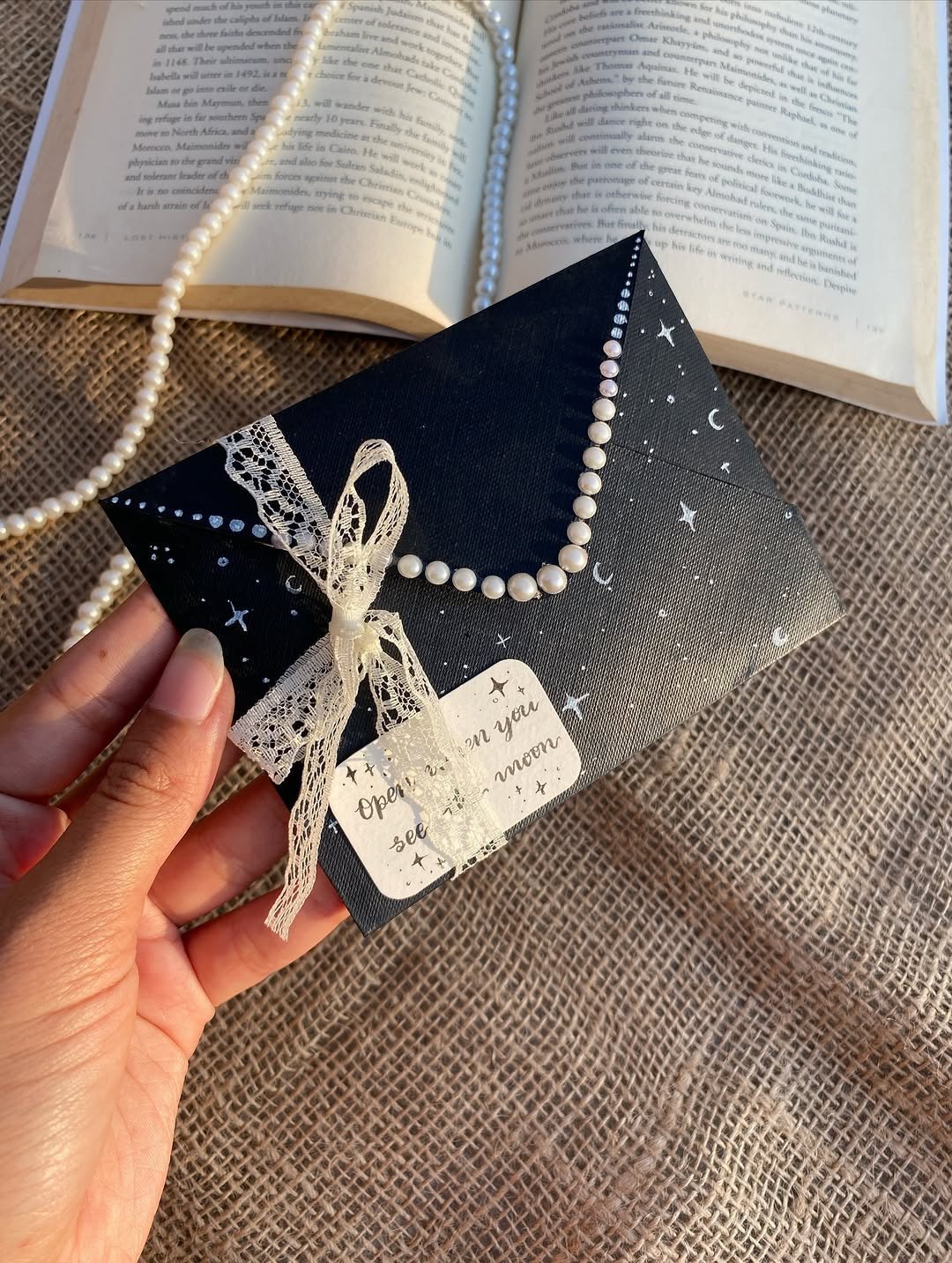
Mini envelope love cards add a tiny paper envelope to the front or inside of the card, creating a sweet little pocket for a note, photo, or flat keepsake. They feel playful right away, and they bring a surprise element that makes the card more interactive and memorable.
This idea works especially well for romantic notes, friendship cards, and anniversaries. You are not just giving a message. You are giving a small moment to open.
The tiny pocket that steals the show
There is something charming about scale. A little envelope on the front of a card catches the eye because it feels unexpected and almost storybook-like. You see it and immediately want to know what is tucked inside.
You can make the envelope from patterned paper, plain kraft paper, or a soft solid color that matches the rest of the card. Red and blush feel classic for love notes, but sage green, cream, and dusty blue can feel just as sweet. The card gains shape and movement because the flap, the tucked note, and the layered paper all create depth.
This is also one of the easiest ways to make a simple card feel personal. Even if the card front is plain, the act of pulling out a tiny message makes the whole piece feel thoughtful and intimate.
What to tuck inside
The insert can be more than a standard note. You might slip in a short list of reasons you love someone, a tiny drawing, a mini photo print, or a pressed petal wrapped in tissue. Flat items work best so the envelope stays neat and the card can still close comfortably.
A handwritten message in a small folded strip has a special feel. It slows the reader down. Instead of opening a card and seeing everything at once, they get a second moment, and that second moment is often the part they remember.
Keeping it cute, not bulky
Because the envelope sits on the card, size matters. Keep it small enough that it acts like a detail, not the whole structure. A tiny square or narrow rectangle usually looks best, especially if you leave some clean space around it.
Glue only the back of the envelope body and leave the flap free if you want it to open. If the pocket feels fragile, add a very thin line of glue at the side corners and press it with a bone folder or the edge of a ruler for a crisp finish. Strong folds make the envelope look sharper, and that alone can lift the whole card.
Credit to @nova_crafty
4. Layered Heart Collage Designs
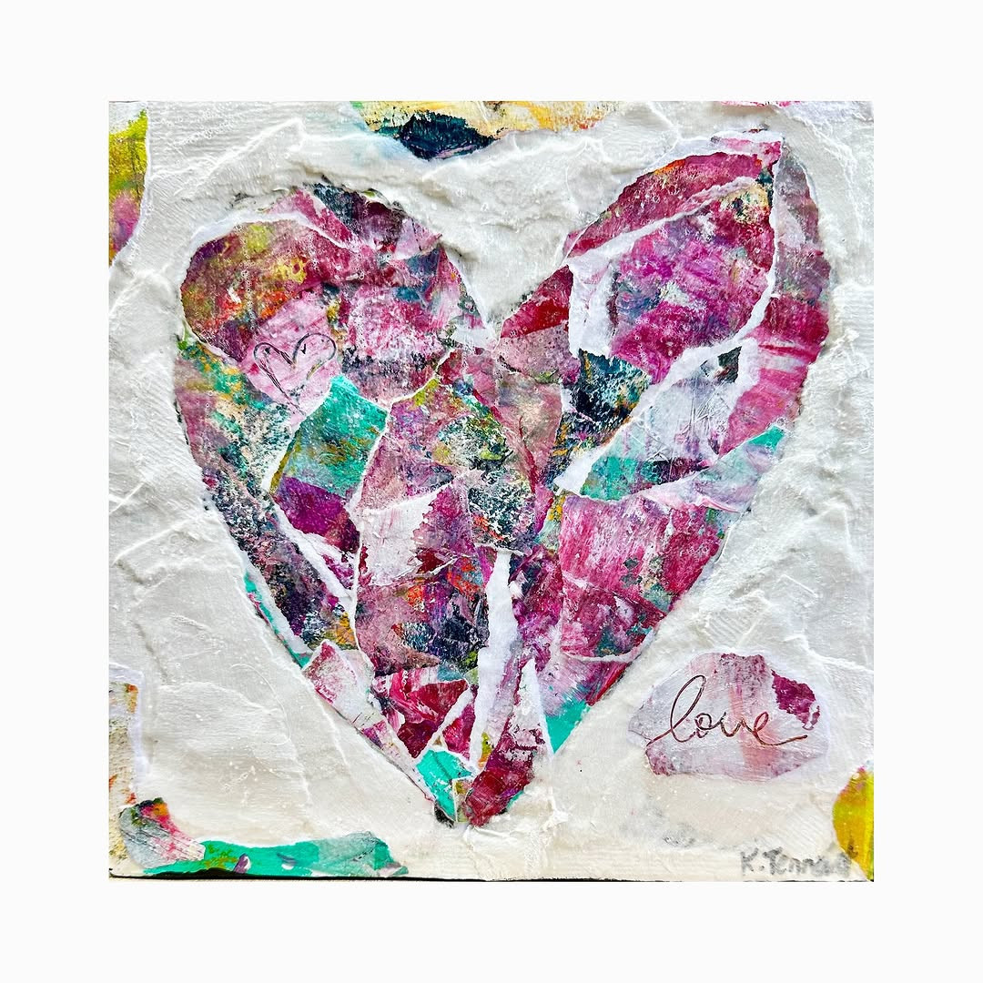
Layered heart collage designs build a card front from stacked paper hearts in different colors, sizes, and textures. The effect is cheerful, warm, and full of movement, which makes this style perfect when you want a handmade card that feels bright and full of care.
This idea is easy to personalize because you can change the palette, the paper finish, and the layout in dozens of ways. It can look playful for a child, sweet for a friend, or more polished for a partner.
Depth from simple shapes
A heart is familiar, but layering changes it. Once you stack several hearts with foam dots, folded centers, or offset edges, the card starts to feel lively and textured. Light hits the raised paper differently, so even simple cardstock feels more interesting.
You can keep the design tidy with one large focal heart made from smaller layered pieces, or scatter many small hearts across the front for a more energetic look. Both work. The better choice depends on the mood you want. A centered cluster feels thoughtful and calm, while a shower of hearts feels joyful and full of motion.
Mixing color without making a mess
This card style gives you a lot of freedom, but color balance still matters. Pick two or three main shades first, then add one accent. Blush, cherry red, and cream are always pretty together, but soft peach with terracotta can feel fresh, and pink with navy can look more modern.
Texture helps as much as color does. Try mixing matte cardstock with a little vellum, a scrap of book page, or paper with tiny dots or stripes. The shapes stay simple, so the texture becomes part of the charm without making the card hard to read.
I like to test the layout before gluing anything down. Move the hearts around, step back, and look for one spot that feels too heavy or too empty. Small changes can make the front look much more polished.
Ways to make it personal
You can write names or dates on one heart, hide a small message under a folded layer, or use colors that mean something to the person receiving the card. Those choices turn a pretty design into a card that feels made for one person, not just anyone.
Another lovely option is to leave some hearts flat and raise others with foam tape. That gives the collage a rhythm. Your eye travels across the card instead of landing in one place and stopping there.
A polished finish that still feels handmade
The cleanest version of this card has one clear focal area and plenty of breathing room around it. You do not need to fill the whole front. A strong cluster of layered hearts in the middle or lower third of the card often looks more stylish than edge-to-edge decoration.
If you want the collage to feel a little more grown-up, keep the sentiment small. A tiny “for you” or “with love” near the bottom is often enough. The paper layers already say a lot, and that quiet message helps the design stay sweet rather than crowded.
Credit to @kathleentennantart
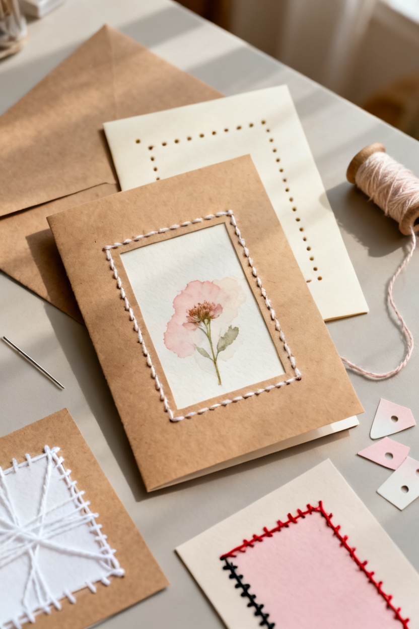
5. Stitched Edge Greeting Cards
Stitched edge greeting cards use simple hand stitching around the border or around a paper panel to add texture, warmth, and a handmade finish. Even the plainest design starts to feel more thoughtful once thread runs across the card in a neat line.
This style is perfect if you want your cards to look crafted in a slow, careful way. Thread adds softness that pen lines and printed borders cannot quite match.
Why thread changes the whole feel
Paper can sometimes look flat, especially if the design is very minimal. Stitching fixes that fast. A row of small even stitches around the edge brings texture, shadow, and a little movement, and it tells the eye that a real hand spent time on this piece.
You do not need complex sewing skills. A running stitch, backstitch, or even widely spaced straight stitches can look lovely. White thread on kraft paper feels rustic, red thread on cream feels sweet, and black thread on pale pink can look modern and sharp.
Where to stitch for the best effect
The border is the easiest place to start because it frames the whole card. You can stitch close to the edge for a neat picture-frame look, or place the stitches around a smaller rectangle in the center to highlight a sentiment or collage piece. Both choices help guide the eye.
Spacing matters here more than fancy patterns. Mark tiny guide points with a pencil and keep the holes even. If the stitches pull too tight, the paper can bend, so leave the thread just loose enough to lie flat. That one small habit makes the finished card look much cleaner.
You can also combine stitching with other handmade details. A stitched border around a watercolor panel or a pressed flower window creates a lovely mix of soft and structured elements.
Choosing paper, needle, and thread
Heavier cardstock holds up best because the holes will weaken thin paper. Use a fine needle, embroidery floss split into fewer strands, or simple sewing thread if you want a delicate look. Thicker thread makes a stronger statement, but it can also leave bigger holes, so test it on scrap paper first.
6. Vintage Lace Accent Cards
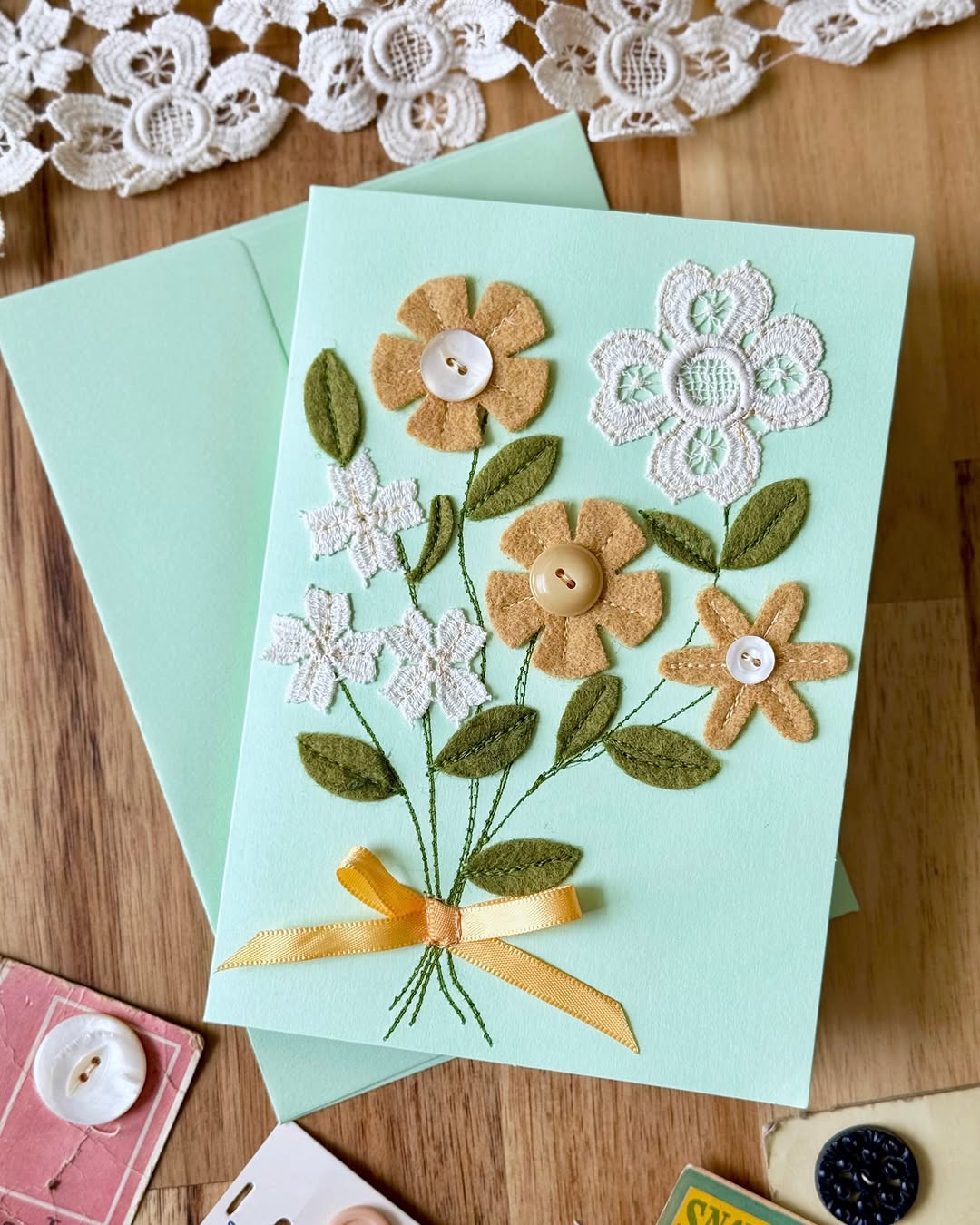
Vintage lace gives a handmade card a soft, old-world look that feels warm and personal. It turns plain cardstock into something that looks found, saved, and loved. If you like cards with gentle color, tiny details, and a little romance, this style is hard to beat.
Soft details that feel timeless
Lace accent cards work best when you keep the rest of the design calm. Think cream paper, dusty rose, faded blue, soft gray, or warm beige. A strip of lace along one edge can be enough, especially if the paper already has a light pattern or a slightly aged look. You do not need to cover the whole card. In fact, too much lace can make the design feel heavy.
You can use real lace trim, a lace paper doily, or even lace printed paper if you want an easier version. Real trim adds texture, and that is what makes these cards feel rich. A small pearl, a postage-style label, or a tea-stained tag can help finish the look. I like this style for birthday cards, bridal shower notes, and simple thank-you cards that need a quieter kind of beauty.
Why this style wins hearts
People love this look because it feels elegant without feeling stiff. It has charm, but it still feels handmade in the best way. The lace catches your eye first, then the muted paper and little touches make you look again. That second look matters, especially when you want a card to feel memorable.
This idea also works well for crafters who do not want to draw or paint. You can build the whole design with layers, trims, and a thoughtful color mix. If you have scraps in a craft drawer, this is a smart way to use them. Old ribbon, leftover lace, and plain card blanks can become something lovely in under an hour.
A better way to keep it balanced
The easiest mistake here is adding too many antique details at once. Lace, script paper, tags, pearls, stamps, and flowers can all look good, but only when you let one feature lead. Pick one main detail, then support it with two smaller ones. That keeps the card pretty instead of crowded.
A helpful trick is to place the lace first, then step back before gluing anything else down. Once the lace is set, you can see where the eye naturally goes. Put your greeting near that spot, and keep the rest of the card quiet. Your finished piece will feel polished, gentle, and almost too nice to seal in an envelope.
Credit to @steebys
7. Pop-Up Garden Surprise Cards
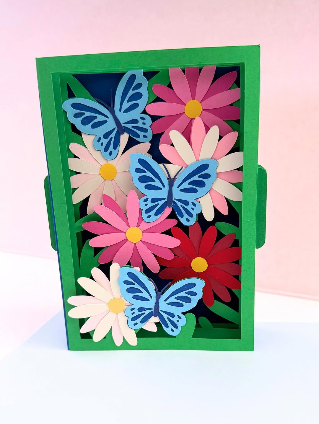
A pop-up garden card looks sweet on the outside, then opens into something cheerful and full of life. That little reveal makes the card feel playful and thoughtful at the same time. It is a great pick when you want your handmade card to feel more like a gift.
The moment the card opens
This style stands out because it creates movement. The front can stay simple, maybe with a small flower, a soft greeting, or a plain border. Then the inside does the big job. Paper flowers, leaves, and small stems rise up when the card opens, giving the whole piece a happy surprise that flat cards cannot match.
You do not need a complicated paper structure to make this work. A few folded tabs can hold simple flower shapes in place. Daisies, tulips, and tiny leaves are easy to cut, even by hand. If you use two or three flower sizes and repeat the same colors inside, the result looks full without becoming messy.
Why people remember this one
Some cards get read and set down. A pop-up card gets opened twice. Maybe three times. That is why people remember it. The inside creates a small event, and that extra moment makes the card feel more personal than a standard folded note.
This style is also useful when you want to make a strong impression with basic supplies. Colored paper, scissors, glue, and a card base can take you far. You do not need fancy tools. You just need a simple plan and enough space inside the card for the flowers to rise without crushing each other.
Good times to make one
Pop-up garden cards fit birthdays, Mother’s Day, spring celebrations, and thank-you notes that deserve more warmth. They are especially good when your message is short, because the design itself carries so much feeling. If you are making a card for someone who saves keepsakes, this style has real staying power.
I also like it for children to give to adults. The interactive part feels fun, but the finished card can still look lovely and polished. Use softer colors for a calm feel, or go bright with pink, yellow, and green if you want the card to feel festive.
Make the inside easier to build
Before you glue any flower pieces down, fold the blank card shut with the tabs resting inside. This quick test shows you if anything sticks out or bends the wrong way. It saves time and stops the common problem of beautiful pop-up pieces getting crushed at the fold.
Keep the tallest flowers near the center fold and the smaller pieces closer to the edges. That one choice helps the card open smoothly and close flat. Add your handwritten message last, once the pop-up pieces are done, so you do not lose writing space where you need it most.
Credit to @creggars.creations
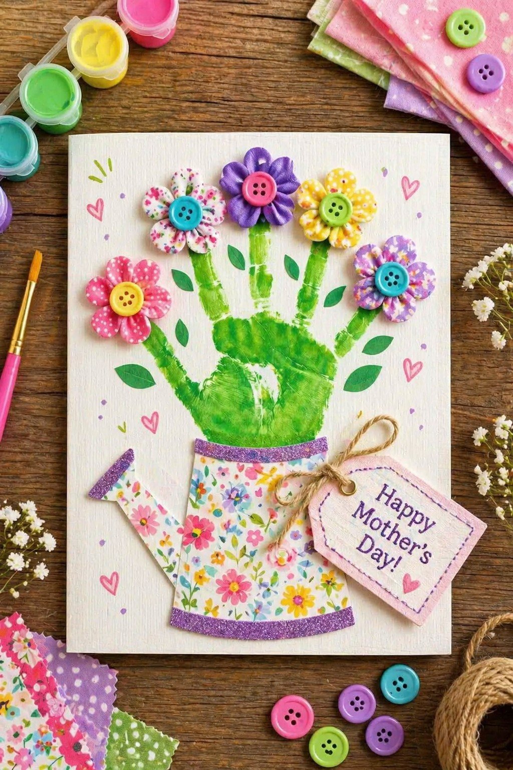
Button bouquet cards turn simple thank-you notes into something cheerful and full of character. A few buttons can become flower centers, petals, or a whole small bunch tied with a paper bow. The look is playful, but it still feels thoughtful and neat.
Small supplies, big personality
This idea works because buttons already bring color and shape to the design. You can mix white, pastel, bright, or vintage buttons depending on the mood you want. Draw thin stems with a pen, glue the buttons above them, and suddenly your card has a bouquet. It is simple, but it never looks flat.
If you want a softer card, use tiny buttons in shades from the same color family. For a brighter look, mix bold colors and different sizes. Round buttons feel classic, but flower-shaped buttons or heart buttons can add extra charm. Even a mismatched mix can work if the layout stays clean and the background stays plain.
Why this style feels so friendly
Thank-you cards should feel warm, and button bouquets do that right away. They have a handmade honesty that printed cards often miss. You can see the layers, the texture, and the tiny choices that went into the design. That makes the note feel more personal before the message is even read.
This is also a smart idea for people who want a craft that is easy to repeat. Once you settle on a bouquet shape, you can make a small set of cards without each one looking exactly the same. Change the button colors, move the stems a little, or swap the greeting style. You keep the same basic plan, but each card still has its own look.
A few pairings that look best
Buttons stand out most on simple card fronts. White cardstock, kraft paper, pale pink, and light blue all work well. A little stamped greeting underneath the bouquet gives the layout direction. If you add too many extra decorations, the buttons lose their charm, so keep the focus on that raised floral cluster.
You can also turn one large button into the center of a single bold flower and place two smaller blooms beside it. That arrangement looks balanced and leaves room for a longer thank-you message inside. It is a good choice when you want the card to feel sweet but not childish.
A practical trick that saves trouble
Buttons are heavier than paper, so glue choice matters. Use a strong craft glue and let the front dry flat before you stack or store the cards. If the buttons shift even a little, the bouquet can start to look uneven.
It also helps to keep the thickest buttons near the middle of the card front instead of close to the fold. That way the card still opens and closes easily. The result looks tidy, feels sturdy in your hand, and gives a simple thank-you note much more presence.
Credit to @juniorsartanddiy
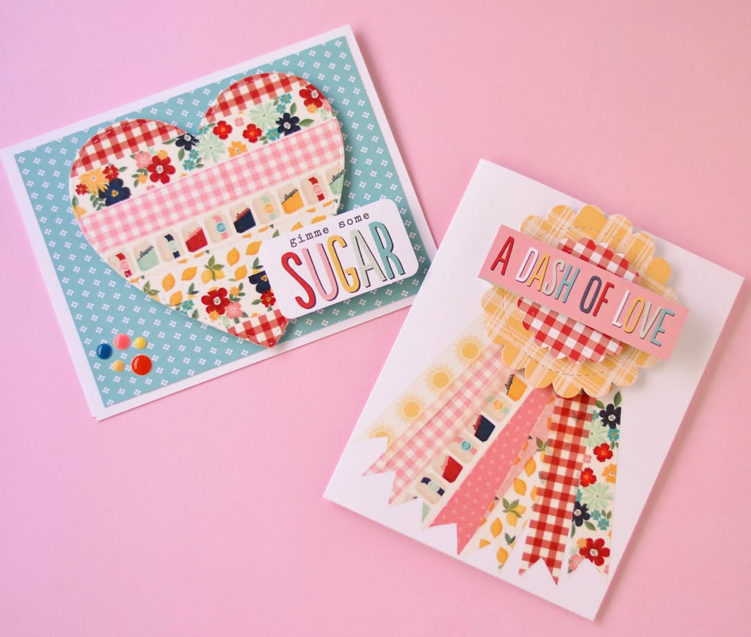
9. Washi Tape Patchwork Cards
Washi tape patchwork cards are bright, fast, and full of pattern. They give you a cute handmade look without asking for advanced skills. If you want something cheerful that comes together quickly, this style earns its place at the top of the pile.
Fast color with a clean finish
Washi tape makes it easy to build a background from small pieces. You can place strips in rows, diagonals, blocks, or a loose patchwork grid. The charm comes from the mix of prints, such as florals, dots, stripes, gingham, or tiny hearts. Since the tape already carries the design, you do not have to draw or stamp much at all.
This idea is useful when your time is short but you still want your card to look thoughtful. A plain card blank can turn bright and polished in minutes. Add a small label with a greeting over the top, and the whole front looks intentional. I have made these when I needed several cards in one afternoon, and they still felt special.
Patterns that actually work together
The easiest way to make patchwork look good is to limit your color palette. Pick two or three main colors, then let the patterns vary inside that range. That keeps the card lively without letting it turn chaotic. A black-and-white mix with one bright color is especially striking.
You can also use different tape widths for a more layered look. Thin strips create detail, and wider strips fill space fast. If every strip has the same width and the same print strength, the card can feel flat. A little contrast gives the patchwork more life.
Best uses for this cheerful style
Washi tape cards fit birthdays, thank-you notes, teacher cards, and just-because greetings. They work well for teens and adults because the patterns can shift the mood so easily. Soft florals feel gentle. Bold stripes and bright shapes feel modern and playful.
This style is also kind to beginners. You can cover a mistake with another strip, trim the edges clean, and keep going. There is no pressure to make every part perfect. That freedom makes the process more fun, and the finished card still looks neat if you keep the layout controlled.
One layout move that helps every time
After placing your tape, trim the edges only after the whole front is covered. If you cut each strip as you go, small gaps often appear along the sides. Cover first, trim last. It is a small step, but it makes the card look sharper.
Try leaving one small open area for the greeting instead of placing words on top of a busy pattern. Your message will stand out better, and the design will feel less crowded. Sometimes the prettiest card is the one that knows when to stop.
Credit to @fawn_parties
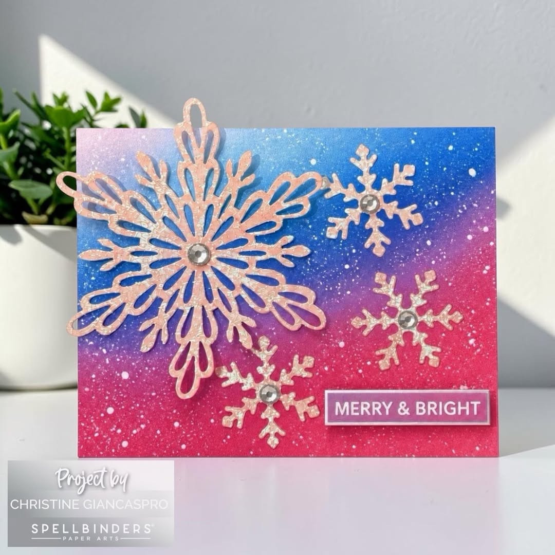
10. Embossed Snowflake Holiday Cards
Embossed snowflakes give holiday cards a raised finish that feels crisp, calm, and polished. The texture catches light in a quiet way, which makes even simple designs look special. For winter cards, few ideas feel this elegant with so little clutter.
Why texture matters so much here
Snowflake cards do not need many extras when the surface already has depth. Raised patterns create interest before you add color, ribbon, or a greeting. That is why embossed designs often look more expensive than they are. The card front feels finished, even when the layout is very simple.
Cool tones suit this style best. White on white looks classic and serene. Silver, pale blue, soft gray, and icy lavender also work beautifully. A touch of shimmer can help, but too much glitter can hide the embossed detail, which is the main reason this design feels so striking.
The look that makes them gift-worthy
These cards often feel too pretty to mail because they have a clean, wintery grace. The raised snowflakes add depth without making the card look crowded. That balance matters. Holiday designs can get busy fast, especially with red, green, foil, and layered phrases all competing for space.
If you want a more modern version, keep the background plain and place one bold greeting across part of the embossed area. If you want something softer, add a vellum layer or a small ribbon near the fold. Both choices keep the focus on the pattern instead of covering it.
Good moments to choose this style
Embossed snowflake cards are perfect for holiday greetings, winter thank-you notes, and seasonal party invitations. They also suit people who prefer understated design over bright holiday themes. Some recipients love cheerful color. Others keep the cards that feel peaceful and refined. This style speaks to that second group.
Credit to @aheartfeltcard
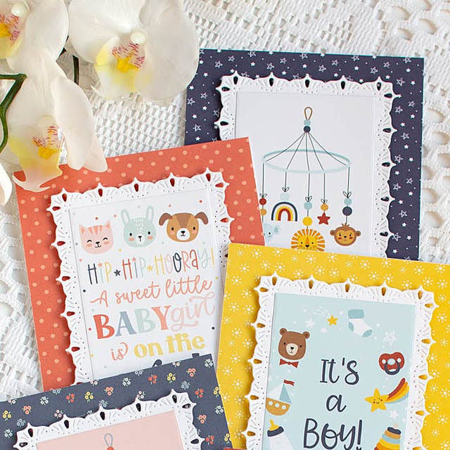
11. Scalloped Pastel Baby Cards
A baby card should feel soft before the message is even read. That is why scalloped edges, pale color, and gentle shapes work so well together. They bring a sweet, calm look that fits a baby shower, a first birthday, or a quiet note to new parents.
Soft Shapes That Change Everything
Scalloped edges do a lot of work with very little effort. A plain folded card can look simple in a flat way, but a rounded border gives it warmth right away. You can cut the edge with craft scissors, use a punch, or trace small curves by hand if you want a more homemade finish. The shape feels playful, yet still neat, and that balance is what makes this style easy to love.
Pastel shades help the design stay light. Think blush pink, butter yellow, pale mint, soft lilac, or powder blue. These colors look gentle without fading into the background, especially when paired with white space. If you add baby details like tiny stars, moons, clouds, or a small stroller shape, the card starts to feel themed without looking crowded.
Details That Keep It From Looking Too Busy
The best version of this card uses restraint. A scalloped frame, one soft color family, and one focal detail are often enough. You might place a small layered teddy bear in the center, add a stamped “welcome little one,” or use a thin strip of gingham paper near the bottom. Each touch should support the calm mood, not compete with it.
I like this idea for group gifts because it photographs beautifully and still leaves room inside for many messages. It also works well if you want a handmade card that feels polished but not stiff. For a baby celebration, that matters. You want the card to feel joyful, tender, and easy to keep, almost like a small piece of nursery decor folded in half.
Credit to @houses_built_of_cards
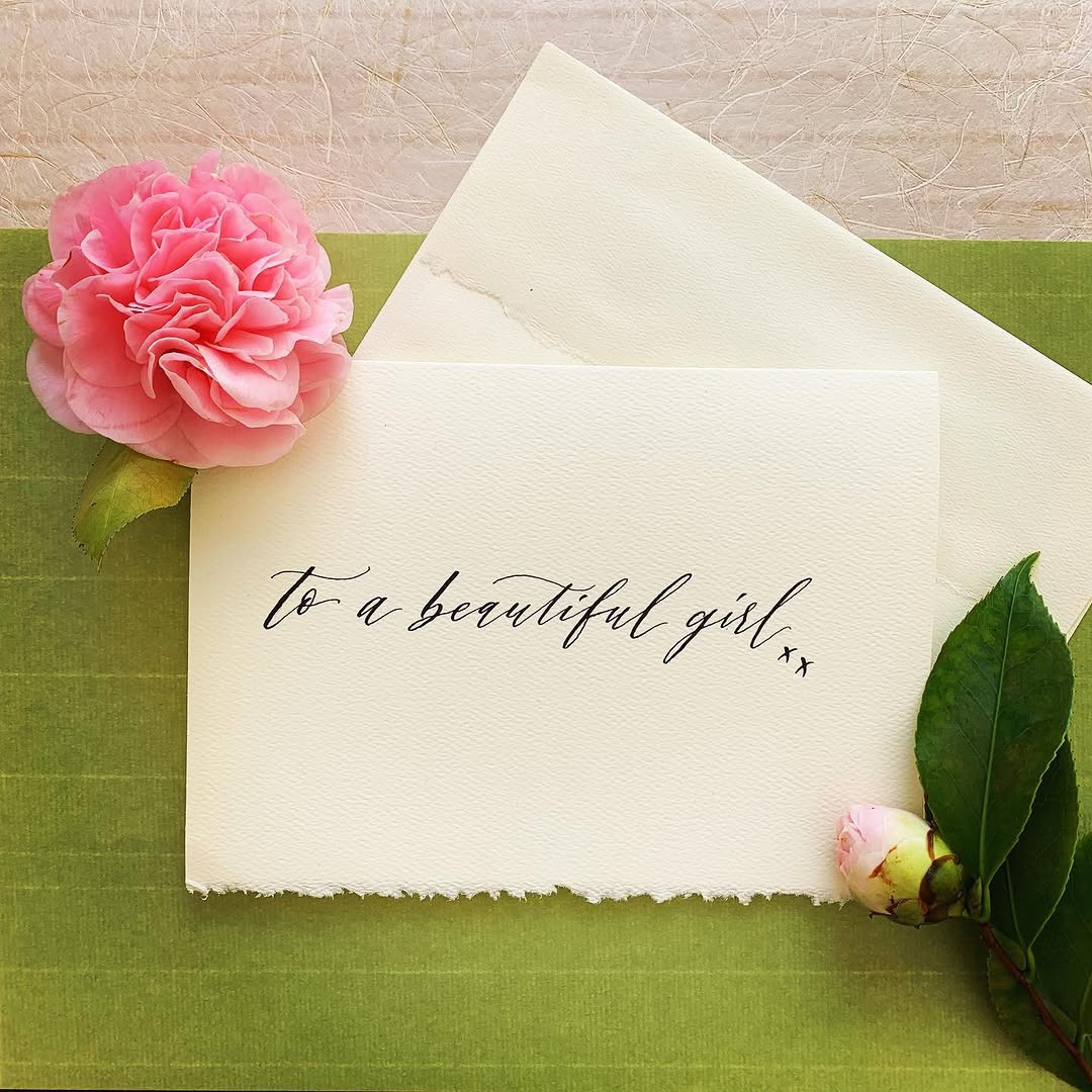
12. Hand-Lettered Minimalist Greeting Cards
Sometimes the prettiest handmade card has almost nothing on it. A few well-placed words, clean spacing, and strong hand lettering can carry the whole design. This style feels modern, personal, and calm, which makes it perfect when you want the message to lead.
Why Less Feels More Personal
Minimalist greeting cards stand out because they do not try to fill every inch of space. The empty area around the words gives the eye a place to rest, and that makes even a short phrase feel thoughtful. “So happy for you,” “thinking of you,” or “happy birthday” can look striking when written by hand in the center of a thick white or cream card.
You do not need perfect calligraphy to make this work. In fact, a little character makes the card feel more real. A brush pen gives smooth lines, but a black fine-tip pen works too, especially if your style leans simple and graphic. The goal is not fancy writing for its own sake. The goal is clear feeling on clean paper.
Simple Design Choices That Look Expensive
Color matters more when there is less of it. Black ink on white cardstock feels crisp and modern. Dusty rose, sage green, or muted navy can soften the look without losing that clean finish. A tiny painted dot, a thin border, or one small gold star can be enough decoration if the lettering is the star of the design.
This is also one of the easiest handmade card ideas to match to different events. A wedding card can use soft script. A thank-you card can use bold block letters. A friendship card might mix upper and lower case in a loose, casual style. The layout stays spare, but the feeling changes with the words and the way you write them.
Where This Style Works Best
Minimalist cards are great when you want something handmade that still feels grown-up. They suit adult birthdays, sympathy notes, graduation cards, and thoughtful thank-you messages. Because the front stays clean, you can put more emotion inside without the whole piece feeling heavy.
I also think this style is ideal if you make cards in batches. Once you settle on a few lettering layouts, you can repeat them with different phrases and still have each card feel unique. That makes the process easier, and the result still looks worthy of saving in a drawer long after the day has passed.
Credit to @tigerflossstudio
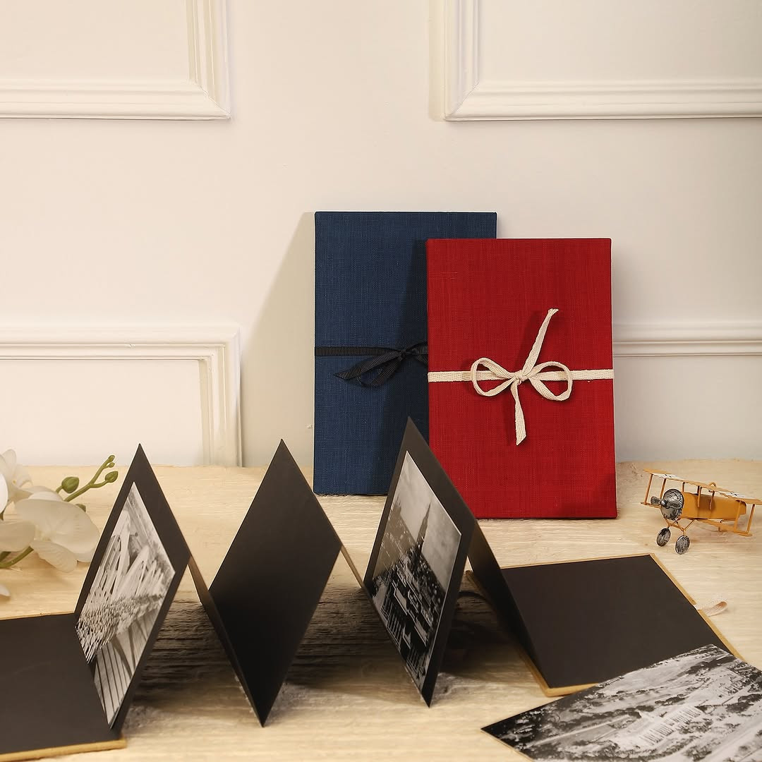
13. Ribbon-Tied Keepsake Foldouts
A foldout card already feels special because it asks the reader to slow down and open each part. Add a soft ribbon tie, and the card turns into a small keepsake that feels closer to a gift than a simple note. This idea works well for big birthdays, anniversaries, baby showers, and any moment that deserves more than a quick message. You can build it from one long piece of cardstock folded into panels, then wrap ribbon around the closed card to hold everything together neatly.
More Room, More Story
The extra panels give you space for photos, small notes, date markers, or tiny pockets that hold tags and flat mementos. One panel can carry the main greeting, another can hold a favorite picture, and the last can include a longer personal message. That layered format makes the card feel intimate because each section reveals something new. It also helps you organize your design instead of cramming every detail onto one front cover.
Ribbon changes the mood in an instant. Satin looks soft and dressy, cotton ribbon feels relaxed, and velvet adds rich texture for winter holidays or milestone events. Keep the color simple so the foldout still feels elegant. Blush, ivory, dusty blue, or even a classic black ribbon can make handmade paper details look polished. I have seen people save cards like this in memory boxes for years, and it makes sense. They feel made to keep.
How To Keep It Pretty And Practical
The smartest approach is to plan the inside before you decorate the outside. If you know where photos, writing, and embellishments will sit, the card stays balanced and closes flat. Avoid bulky layers near the fold lines, and place thicker details toward the outer edges of each panel. A narrow ribbon usually ties more neatly than a wide one, especially if the card already has several sections inside.
You can also use this format when one message is not enough. That is what makes it so memorable. A ribbon-tied foldout lets you tell a fuller story, and the card becomes part of the gift itself.
Credit to @anandprakash1
Conclusion
Pretty cards do more than carry words. They hold a moment.
If you want a handmade card idea that people actually save, these three styles are strong choices. A scalloped pastel baby card feels tender, a hand-lettered minimalist design feels modern, and a ribbon-tied foldout feels like a keepsake from the start. Pick the one that fits the occasion, then make it your own with color, paper, and a message that sounds like you. Save these ideas now, and the next time you need a card, you will have something far better than store-bought.