You do not need to settle for craft projects that look childish, uneven, or stuck in a school art box. These 14 ideas help you turn plain wooden sticks into decor that feels clean, polished, and stylish enough for a living room, bedroom, or office.
Think crisp black lines on a white wall, pale wood beside soft candlelight, and smooth frames with a satin finish that catch the light just right. The beauty is in the detail. Sharp spacing, quiet colors, and better finishes can change everything.
Inside, you will find 14 smart ways to make simple materials look far more expensive than they are. Some feel modern, some feel warm, and all of them prove that small pieces of wood can create a high-end look when you use them with care.
1. Painted Wall Art Grids
Painted wall art grids turn basic popsicle sticks into sharp geometric decor with a calm, modern feel. This idea works because the pattern does the heavy lifting. When the spacing is even and the paint finish stays soft and matte, the final piece feels more like gallery art than a weekend craft.
Why This Looks So Clean
The secret is restraint. You do not need glitter, bright rainbow paint, or extra embellishment to make this project stand out. A simple layout in black, white, sand, clay, or muted green gives the grid a polished look that feels current and easy to style.
Symmetry matters here. If one line drifts or one square looks wider than the next, the eye catches it fast. I have seen this project look expensive with the simplest design, and I have also seen it lose its charm when the spacing gets rushed.
Design Choices That Matter
You can build a square grid, a set of diagonal lines, or a layered pattern that creates depth on the wall. The best versions usually stay within one or two tones, because too many colors can make the piece feel busy. A cream background with charcoal sticks looks elegant, and pale wood washed in warm white can soften a room with lots of hard surfaces.
Scale changes the mood. A small panel feels neat and quiet, but a larger piece can anchor a blank wall over a console or bed. If you want it to feel more custom, mount the finished grid on a flat canvas or wood board painted the same tone as your trim.
Finishing Moves Worth Your Time
Sanding each stick before paint makes a huge difference. You want smooth edges, no fuzzy wood fibers, and no glue strings caught in the corners. Use a ruler, mark the layout first, and dry-fit the pattern before you commit.
Choose matte acrylic or chalk-style paint instead of glossy craft paint. Gloss can make the surface look plastic, and that cheap shine gives away the material right away. If you seal the piece, use a flat top coat so the soft painted finish stays intact.

Credit to @ventunoart
2. Minimalist Hexagon Shelves
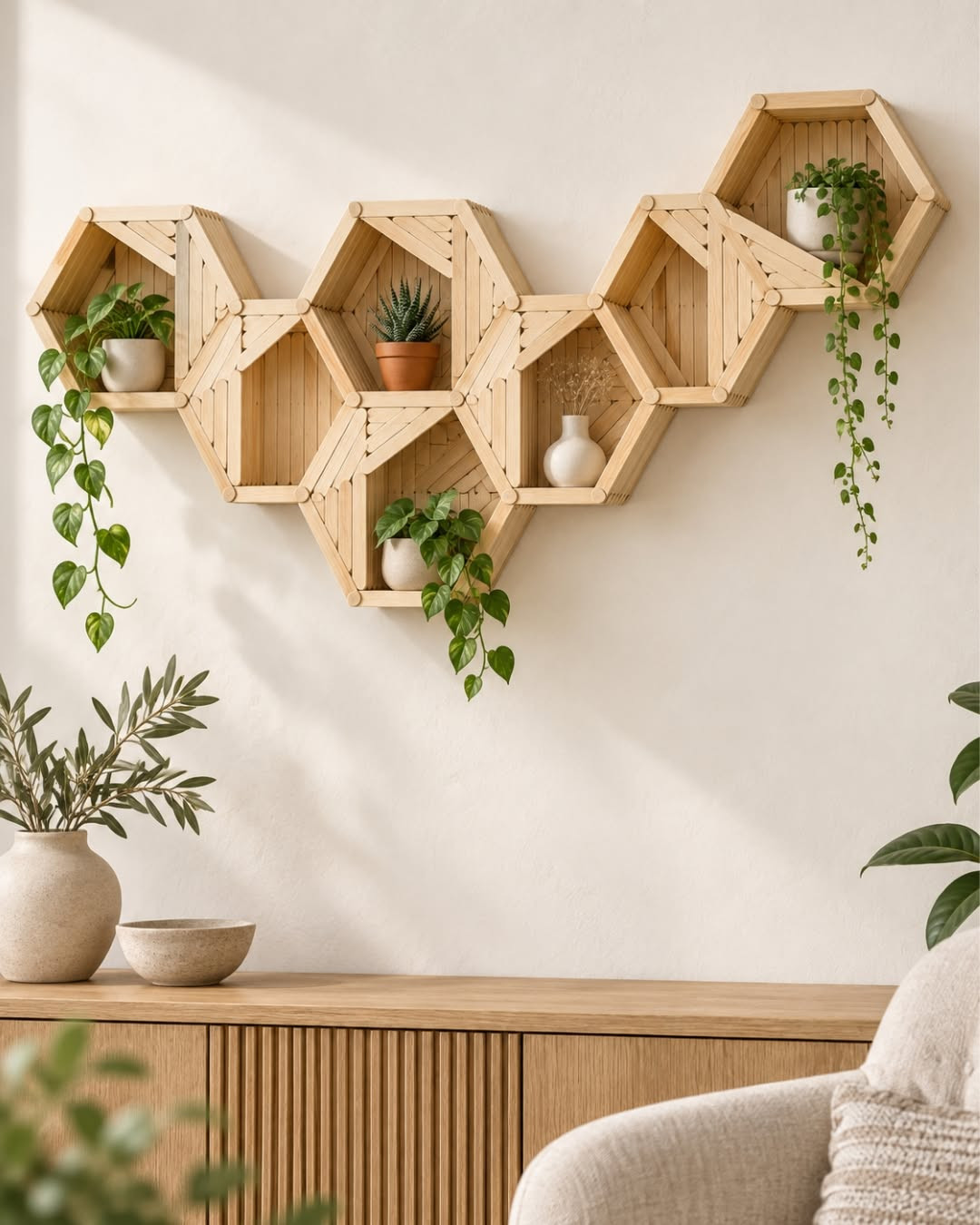
Minimalist hexagon shelves show how popsicle sticks can move beyond decor and into something useful. They look light, modern, and a little architectural. When the joints are strong and the finish stays even, these small shelves can hold tiny plants, air plants, or a candle and still look refined.
Small Shape, Big Style
The hexagon shape has a clean rhythm that fits modern interiors well. It feels more interesting than a plain square, yet it still reads as simple. That balance is why this project works on open wall space, especially in rooms that already use soft neutrals, pale woods, and minimal styling.
You do not need to make them large. In fact, smaller shelves often look better because the material feels more believable at that scale. A cluster of two or three in matching finishes can create a designer look without asking the sticks to do too much.
How To Keep Them From Looking Fragile
Structure is the whole story here. A weak joint will pull the shelf into the craft zone fast, so glue alone is rarely enough if the shelf will hold any weight. Doubling the sticks at each side, pressing the angles carefully, and adding a solid backer inside the frame can help the shelf keep its shape.
I like the look of a hidden backing board painted the same color as the wall or shelf. It gives the piece more strength and lets the hexagon read as a finished object instead of a delicate experiment. Once the edges are sanded smooth, the shape looks far more intentional.
Best Finishes For A Modern Look
Natural stain, warm white, soft black, and light oak tones work best for this idea. You want a finish that feels calm and even, with no visible drips or thick brush marks. If one side is glossy and another side is flat, the shelf starts to look homemade.
Keep the styling spare after it is hung. One small ceramic bud vase or a trailing mini plant is enough. Overfilling a tiny shelf makes the whole piece feel less elegant, and the beauty of this project comes from its airy shape and quiet presence.
Credit to @diyjkcreation
3. Faux Designer Picture Frames
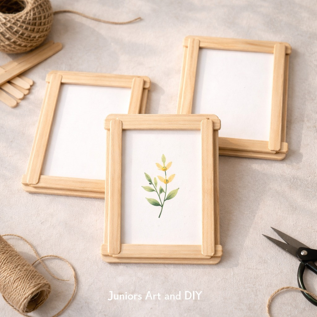
Faux designer picture frames are one of the smartest ways to make popsicle sticks look expensive. Frames already rely on trim, layering, and finish, so the material blends in more naturally here. With careful sanding and a rich stain or smooth lacquer, the final piece can look surprisingly close to something from a home store.
Where The High-End Look Comes From
A plain flat frame can work, but layered detail is what makes this idea feel special. By stacking sticks to create a narrow raised border, you give the frame shadow lines and depth. That small detail helps hide the humble material and creates the kind of profile people expect from store-bought decor.
Proportion matters too. A very wide border can feel clunky, especially with a small photo. Narrow to medium-width frames usually look best because they feel balanced and neat, and they let the finish stand out.
Surface Prep Changes Everything
This project rewards patience. If the wood feels rough or the cut ends look splintered, stain will soak in unevenly and highlight every flaw. Sand first, wipe away dust, and fill any visible gaps before you add color.
Dark walnut stain, matte black paint, and soft cream lacquer all work well. The right choice depends on the mood you want. Dark stain feels classic and richer, black looks crisp and modern, and pale lacquer suits lighter spaces with a softer style.
You should also think about the backing. A sturdy back panel and clean corners help the frame feel complete. If the front looks beautiful but the back bows or gapes, the piece loses some of its polish.
Smart Ways To Style The Finished Frame
These frames look best when they hold simple art prints, black-and-white photos, or line drawings. Busy images can compete with the handmade detail. A quiet image lets the frame itself carry more visual weight.
I also like grouping several frames in one finish for a small wall display. Matching frames create unity, and that makes the handmade origin much harder to spot. The result feels collected, calm, and far more expensive than the supply list suggests.
Credit to @juniorsartanddiy
Scandinavian style candle holders bring a soft, quiet elegance to popsicle stick crafts. This look is all about clean lines, pale tones, and simple shapes that let texture and light do the work. When candlelight hits smooth wood and a matte finish, the result feels warm and boutique-like.
Why Simplicity Wins Here
This project does best when you resist the urge to decorate every side. Scandinavian-inspired pieces rely on shape, balance, and subtle contrast, not extra ornament. A clean cylinder wrap, a square sleeve, or a low geometric holder can all feel beautiful if the form stays crisp.
Color should stay soft. Think whitewash, pale beige, light gray, or natural wood with a clear matte seal. Those shades reflect candlelight in a gentle way, and they help the holder blend into calm interiors without looking plain.
Making It Feel Safe And Thoughtful
You do need to plan the construction carefully, since these pieces sit near heat. Popsicle sticks work best as an outer decorative shell around a safe glass votive or another heat-proof insert. That way, the wood gives the style, but the glass handles the flame.
The spacing between sticks can change the mood. Tight placement looks refined and smooth, while small gaps create a lantern effect with thin lines of light. Both can work, but the cleaner option often looks more expensive in daylight when the candle is not even lit.
The Texture That Makes It Special
Wood grain is part of the charm. A very light sanding keeps the surface soft to the touch and helps the pale finish settle evenly. You want the holder to feel pleasant in the hand, almost like something from a small design shop.
A matte sealer is usually the better choice here because glossy shine can fight against the calm, natural look. Put the holder on a tray with stone, ceramic, or linen nearby, and the whole setup feels intentional. It is a small project, but it can shift the mood of a table fast.
5. Midcentury Plant Stand Covers
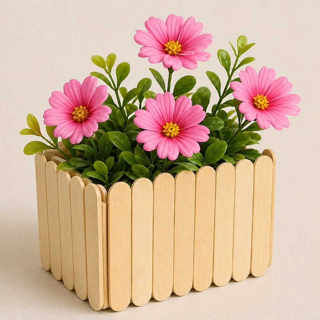
Midcentury plant stand covers use popsicle sticks to wrap plain pots in sleek vertical slats. The finished look feels warm, structured, and very indoor-garden friendly. This idea works especially well if you love the clean lines of vintage planters but do not want to pay designer prices.
The Slatted Look That Hides The Craft Supply
Vertical slats instantly make a pot look more tailored. Instead of seeing separate little sticks, the eye reads a repeating pattern, almost like a wood screen or planter box. That shift is what makes the project look less crafty and more furniture-inspired.
Round pots can work, but straight-sided containers are often easier to cover neatly. The cleaner the base shape, the better the slatted wrap will sit. If the pot tapers too much, the spacing can look awkward and ruin the smooth midcentury feel.
Color And Finish Set The Tone
Warm walnut stain is a natural fit for this style. It gives the slats that classic midcentury mood and pairs well with leafy green plants. Soft teak tones, muted black, or even a smoked oak effect can also look striking if the finish stays even and the wood grain still shows a little.
You can pair the cover with simple black legs or rest it on an existing stand. The contrast between slim dark legs and warm wood slats creates that familiar vintage look many people want. I think this is one of the most convincing ways to use popsicle sticks in home decor because the repeated lines feel so intentional.
What Makes It Look Custom
Precision matters more than complexity. If each slat is cut to the same height and placed with equal spacing, the whole piece feels measured and deliberate. Small errors show up fast on a round surface, so marking the layout before gluing saves time and frustration later.
Choose a plant that suits the look. Snake plants, pothos, and rubber plants all pair well with this style because their shapes feel sculptural and tidy. A lush plant rising from a smooth slatted cover gives you that polished, collected look people often assume came from a boutique shop.
Credit to @iluartandcraft
6. Textured Mirror Border Designs
Textured mirror borders turn plain glass into a framed accent with depth and order. This idea works because repetition hides the humble material and creates a pattern your eye reads as intentional. If your sticks are cut to the same length, lined up with care, and finished in one calm color, the result feels closer to boutique decor than a weekend experiment.
A frame that adds depth
A simple wall mirror can look flat and unfinished, especially in an entry, bedroom, or powder room. When you build a border from popsicle sticks, the goal is not to show the sticks at all. You want to show rhythm, shape, and shadow. That is why stacked rows, angled layouts, and narrow layered bands work so well. They create dimension around the mirror, and that depth makes the whole piece feel more expensive.
I like this idea because it gives you room to be precise. You can place the sticks in a sunburst pattern, a clean herringbone line, or a tight square grid. Each style changes the mood. A whitewashed border feels soft and airy. Matte black looks sharp and modern. Warm oak stain gives it a more classic look without asking for much effort.
Why it looks store-bought
The finish matters as much as the layout. Rough edges, glue strings, and uneven spacing are what make many craft projects look homemade in the wrong way. Sand every cut end. Dry fit the whole border before you glue. Then paint or stain the frame after assembly so the surface reads as one piece instead of many separate sticks.
This is also a smart project for small spaces because it adds style without adding bulk. You can hang it above a dresser, lean it on a shelf, or use it in a narrow hallway where larger framed mirrors feel heavy. If your room needs one focal point, this can do the job quietly and well.
Best way to keep it clean
Choose one repeat pattern and stay loyal to it. Mixing too many shapes in one mirror border can make the frame look busy fast. A single pattern, carried all the way around with even spacing, gives the mirror a calm structure that feels designed on purpose.
If you want a softer finish, use wood filler in any small gaps before painting. That one step changes the surface a lot. It helps the border read as a true frame instead of a puzzle of tiny craft pieces.

Credit to @tiny_craft_tales
7. Architectural Desk Organizer Trays
Architectural desk trays use straight lines and tidy compartments to make a workspace feel composed. The best versions look almost like scaled-down drawer inserts, with shallow walls, even spacing, and a finish that matches the rest of your desk. You are not just making storage here. You are shaping visual order.
Why structure changes everything
A desk can get cluttered in a day. Pens roll, clips scatter, sticky notes pile up, and suddenly the whole space feels noisy. A tray made from popsicle sticks solves that problem best when it has a clear floor plan. Think long rectangle for pens, square well for clips, and one open section for small paper items. Those little divisions make the tray feel thought through, and that is what gives it a more polished look.
The word architectural fits for a reason. These trays work when the lines are crisp and the walls are consistent in height. If one section is tall and another is crooked, the piece starts to feel casual. If every corner meets neatly and each compartment has enough room to breathe, the tray looks closer to a desk accessory from a design shop.
Where this idea shines
You will get the most from this project on a home office desk, a study corner, or even a bedside table where small items drift around. It is also useful if you work with limited space and need storage that stays low and flat. A tray can hold what you need without blocking your view or crowding the surface.
I have seen this look especially good in solid colors. Deep charcoal, soft beige, olive, and warm walnut all help the tray blend with modern decor. Clear gloss can make it look plastic, so a matte sealer is usually the smarter choice. It keeps the look calm and clean.
Small choices that make it better
Build the base on a piece of cardstock or thin board first, then add the stick walls on top. That gives the tray a stable bottom and keeps the shape square while the glue dries. Measure each compartment before you commit, because even a few extra millimeters can decide whether a pencil fits neatly or sits at an awkward angle.
If you want the tray to feel more custom, line the inside bottom with linen-look paper or a plain neutral felt. Keep it subtle. A quiet interior finish adds just enough detail without pulling attention away from the clean frame.

8. Layered Jewelry Display Panels
Layered jewelry panels help necklaces, earrings, and bracelets look arranged instead of stored. This project works best when you create depth with raised frames, soft backing, and balanced spacing. The finished piece can hang on a wall or stand on a dresser, and it gives your accessories the kind of display that feels edited and calm.
More like decor than storage
Jewelry can look messy fast, even when it is beautiful. Chains tangle, pairs split up, and tiny pieces disappear into trays. A layered panel solves that by giving each type of item its own place. One level can hold hooks for necklaces. Another can use mesh for earrings. A lower bar or shallow ledge can hold bracelets or rings. That layered setup creates a visual order that feels much more refined than a random holder.
This is one of the easiest ways to make popsicle sticks look elegant because the sticks become the frame, not the focus. Paint them one color, keep the shapes symmetrical, and bring in a soft center material like linen, velvet paper, or fine mesh. Suddenly the whole project reads as a display board, not a craft supply remake.
How to keep the look balanced
Symmetry matters here. If hooks are uneven or one side feels heavier than the other, the panel looks cluttered before you even add jewelry. Try dividing the panel into simple zones. A top band for earrings, a middle drop area for necklaces, and a bottom strip for smaller pieces keeps the design easy to read.
You should also think about what your jewelry looks like when it hangs. Gold pieces stand out against muted green, cream, or black. Silver often looks best on gray, navy, or soft white. Those color pairings sound small, but they shape the final look more than many people expect.
A display worth leaving out
This idea is a good fit for a bedroom, closet area, or dressing corner where you want both function and style. It is especially useful if you wear the same pieces often and want them visible without making the room feel crowded. The panel keeps things at hand, but it still looks decorative from across the room.
Use shallow layers instead of bulky ones. A little lift between sections creates shadow and dimension, which looks polished, but too much thickness can make the panel feel heavy. I would keep the lines slim and the colors quiet. That is where the boutique feel comes from.
9. Boutique-Style Holiday Ornaments
Boutique-style ornaments prove that popsicle sticks can look festive without looking childish. The trick is to use restrained shapes, a small color palette, and details that catch light in a subtle way. When you treat each ornament like a tiny design object, the tree instantly looks more curated.
Simple shapes feel more expensive
Many handmade ornaments go wrong because they try to do too much. Extra glitter, too many layers, and random embellishments can make even a nice idea feel busy. Popsicle sticks work better when you cut them into clean forms such as stars, diamonds, trees, or narrow house silhouettes. Those shapes are familiar, easy to style, and elegant enough to hold their own among glass ornaments.
A strong shape lets you keep the finish simple. Brushed gold, matte white, antique silver, forest green, or soft black all look polished in holiday decor. Add one detail, maybe a metallic edge, a tiny bead, or a velvet ribbon loop, and stop there. That kind of restraint makes a big difference.
How these ornaments fit your holiday style
If your tree leans classic, these ornaments can fill in gaps without fighting the rest of the decor. If your tree is more modern, they may become the main event. They also work well for gift toppers, wreath accents, and garland details because they are lightweight and easy to repeat in sets.
I love how this project gives you control over the whole collection. You can make six matching pieces for a very clean look, or two shapes in the same color family for a little variety. Either way, the set feels connected. That is what gives it the boutique effect.
Finishing details people notice
Edges matter on holiday pieces because lights hit them from every angle. Sand the sides carefully, and do not leave raw wood if the rest of the ornament is painted. A painted edge or a lightly stained edge looks far more deliberate. Use a thin hanging loop as well. Thick twine can feel rustic, which may not match the cleaner style you want here.
If you plan to add shine, place it with intention. A narrow gold line, a pearl pinhead, or a tiny mirror tile accent will do more than a full coat of glitter. Less really does look sharper on the tree.
10. Clean-Lined Coaster Sets
Clean-lined coasters turn popsicle sticks into practical decor with a real purpose. They work because the shape is simple, the scale is small, and the finish can hide the material almost completely. If you build them with even edges and seal them well, they look neat enough for a coffee table, desk, or guest room.
Why coasters are a smart first pick
Some popsicle stick projects need perfect cuts across large pieces, and that can get frustrating. Coasters are more forgiving because each one is compact. You can focus on accuracy without managing a huge build. That makes it easier to get a professional result. Square coasters, slim rectangles, or even hexagon-style sets can all work as long as the edges line up and the surface feels flat.
This project also earns its place because it is useful every day. A tray or ornament might sit there looking pretty, but a coaster set gets touched, moved, and noticed. If it still looks good after real use, then you know the craft succeeded.
What makes them look polished
The strongest designs use a tight arrangement and one unifying finish. You can lay the sticks side by side, trim the overhang, and add a backing layer for support. Then frame the edge with thin cut pieces so the coaster reads as one complete tile. That little border is often what takes the piece from casual to finished.
Color choice matters here too. Espresso stain gives a richer, more traditional feel. Matte black works well in modern rooms. Pale wood with a satin seal can look Scandinavian and light. I would skip loud patterns unless your decor already leans playful, because coasters look best when they support the room instead of stealing the scene.
The finish that helps them last
A sealed topcoat is what makes these coasters practical, not just pretty. Use a water-resistant sealer in thin coats and let each coat dry fully before adding the next. If the top feels tacky, cups will stick, and the whole set will feel unfinished. Smooth, dry, and level is the target.
Add small cork dots or a full cork backing underneath if you want the set to sit well on wood tables. It protects the surface and gives the coaster a nicer grip. That final layer is easy to miss, but it helps the set feel complete and ready for daily use.
11. Modern Pendant Light Shades
Clean lines that cast real mood
A pendant shade made from popsicle sticks works because repetition looks expensive. When you line up the sticks in even rows or soft curves, the pattern creates rhythm, and rhythm is what makes many designer pieces feel calm and intentional. You are not asking the material to hide. You are asking it to behave like wood slats, and that shift changes everything.
Light helps this project look better than it should. Small gaps between the sticks let shadow move across the wall and ceiling, which gives the whole piece depth. A plain drum shape feels safe, but a tapered form or rounded cylinder often looks more custom and more sculptural from across the room.
Why this one feels high-end
The finish does a lot of the work. If you stain the sticks walnut, black, or white oak, the shade starts to read as modern decor instead of a craft experiment. I have seen simple slatted lights look far better than busy designs with cutouts, beads, or painted patterns, because the eye reads order faster than detail.
You also want clean spacing. Uneven gaps make the piece feel rushed, and thick glue lines ruin the effect right away. If you use a cardboard or wire form underneath, keep it hidden so the outer surface stays crisp and the slats remain the main feature.
Small choices that matter most
Scale is where many people get stuck. A tiny shade can look fussy, but one that is slightly oversized often feels bold and styled on purpose. Think about where it will hang, too. Over a reading corner, bedside table, or breakfast nook, a popsicle stick pendant can become a statement piece without taking over the room.
Use an LED bulb that stays cool, and leave enough open space for airflow. Sand every edge before assembly so the light catches a smooth surface, not rough splinters. That one step gives the finished shade a softer glow and a much better profile.
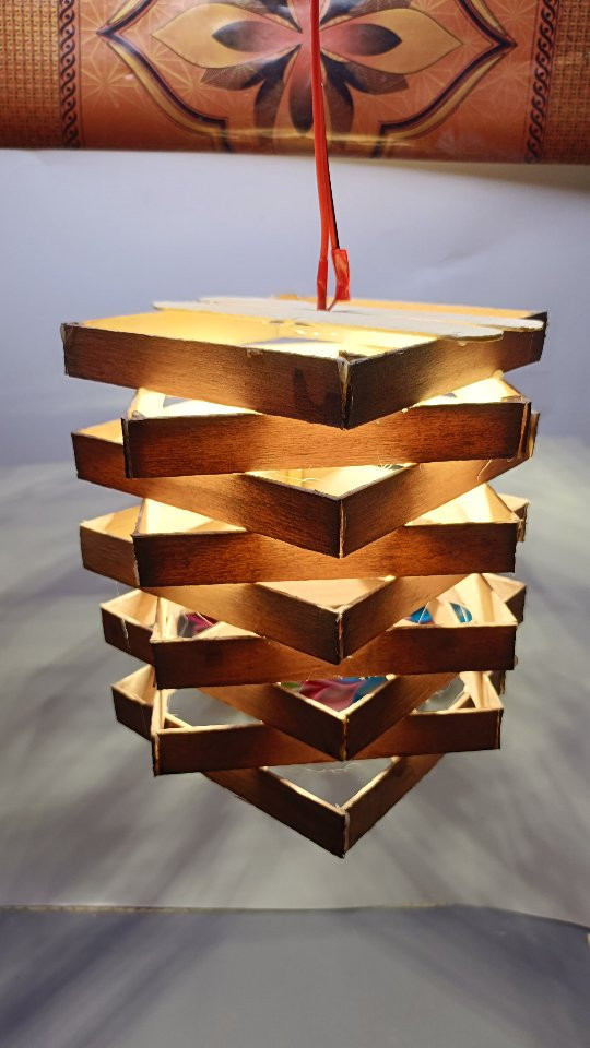
Credit to @craftsbyjunaid_diy
12. Refined Keepsake Box Builds
Storage that looks far more expensive
A small keepsake box is one of the smartest popsicle stick crafts if you want a result that does not look homemade. The shape is familiar, so people judge it by details instead of by material. Tight corners, straight sides, and a lid that fits well will make a simple box feel polished in your hands the second you pick it up.
This is also a project where restraint pays off. You do not need carved patterns, bright paint, or extra trim on every side. A flat lid, a soft stain, and one neat brass knob or tab pull often look better than anything overly decorated.
The difference is in the joinery
Most homemade boxes fail at the seams. If the sticks overlap in obvious layers, the box can feel clunky. A better approach is to cut or place the sticks so the corners look wrapped and even, almost like thin wood strips instead of craft pieces.
You can line the inside with felt, paper, or thin fabric, but keep the color quiet. Deep gray, cream, olive, or black tends to give a more refined look than loud prints. I like a hidden magnetic close or small hinge because it makes the box feel finished without pulling attention away from the shape.
Where this project really shines
This idea works well for jewelry, handwritten notes, watch straps, or tiny desk items that deserve a home. It also makes a strong handmade gift because it feels personal without looking childish. Set on a nightstand or shelf, it can blend in with store-bought decor if the proportions are right.
Make the walls slightly thicker than you think you need, then sand them flush after the glue dries. That gives you a blockier, cleaner profile. Finish with wax or matte sealer, not heavy gloss, because a soft surface tends to look more like real wood and less like coated craft stock.

Credit to @trsartcraft1
13. Slatted Clock Face Projects
Wall decor that quietly steals attention
A slatted clock turns popsicle sticks into something useful and graphic at the same time. The magic comes from symmetry. When the slats are arranged in a circle, square, or sunburst pattern around a simple clock mechanism, the design feels balanced and strong, almost like a piece from a small design shop.
This project works because the eye focuses on layout first. The material fades into the background if the spacing is exact and the hands are well chosen. Black hands on pale wood look crisp. Brass hands on a dark stain feel warmer and a little more dressed up.
Contrast makes the face feel intentional
A good clock needs enough contrast to read from across the room. You can leave off numbers for a cleaner look, or add just four markers at twelve, three, six, and nine. Either choice can work, but the simpler one usually feels more modern, especially if the slats themselves create texture and direction.
The face should have presence. If it is too small, it can look like a craft sample pinned to the wall. A larger size, even around twelve to sixteen inches wide, gives the pattern room to breathe and helps the clock feel like actual decor.
How to keep it out of craft territory
Use one clear visual idea and stick with it. A radial pattern, a stacked grid, or parallel slats across a round base can all look sharp, but mixing all three will muddy the design. I would also avoid bright rainbow paint here. Neutral tones, black, dark brown, and warm natural finishes have a much better chance of looking timeless.
Mount the clock mechanism securely and make sure the hands clear the surface without catching. Then hang it where simple shapes already work well, such as above a console, desk, or narrow shelf. In the right room, this piece reads like wall art first and a clock second, which is exactly why it looks so good.

Credit to @juniorsartanddiy
14. Gallery-Worthy Tabletop Sculptures
Abstract shapes with real presence
A tabletop sculpture is the boldest way to prove popsicle sticks can look like art. You are not making something cute or practical here. You are building form, balance, and shadow, and that gives the project a very different mood from most craft ideas.
The strongest pieces usually stay simple. Think of arches, loops, folded planes, or stacked curves that feel stable but slightly unexpected. If the shape looks good in silhouette, you are already on the right track.
Why proportion matters so much
Abstract decor works when every part feels deliberate. A base that is too thick can make the sculpture look heavy, and thin loose pieces can make it feel fragile in the wrong way. You want tension, but you also want control.
I like to sketch two or three versions first, then build a small mock-up before gluing anything for good. That quick test helps you see if the piece has rhythm from every angle. It also shows where the eye gets stuck, which is often the place that needs less material, not more.
The finish decides the final look
Paint can flatten a sculpture if you choose the wrong color. Matte black gives strong contrast and makes the shape feel modern. Soft white feels airy. A dark wood stain can look rich if the stick pattern stays neat and the surface is sanded well.
Place the finished piece on a stack of books, a console, or an open shelf with some breathing room around it. That space matters. Once you stop treating popsicle sticks like a novelty and start treating them like a design material, the result can look surprisingly gallery-ready.

Credit to @diy_shorts_45
Conclusion
The best popsicle stick crafts do not try to look crafty. They borrow ideas from modern lighting, small furniture, wall decor, and sculpture, then keep the details clean. That is what makes them feel stylish enough to display.
If you want the best result, pick one idea and slow down. Sand more. Measure twice. Use fewer finishes and stronger shapes. Save the designs that match your room, then make the one you can picture in your home right now.