Your kitchen can feel brighter, calmer, and far more pulled together with the right backsplash. The right pattern adds movement, polish, and texture, even if the rest of the room stays simple.
These 11 Herringbone Backsplash Ideas help you turn a plain wall into a standout feature. Think crisp white tile, soft gray grout, creamy marble, warm wood tones, and lines that catch the light from every angle.
If you want a space that feels custom instead of basic, these ideas will show you where to start. Ahead, you’ll find four beautiful directions that can make your kitchen look richer, taller, and more finished without changing everything else.
1. Classic White Subway Herringbone
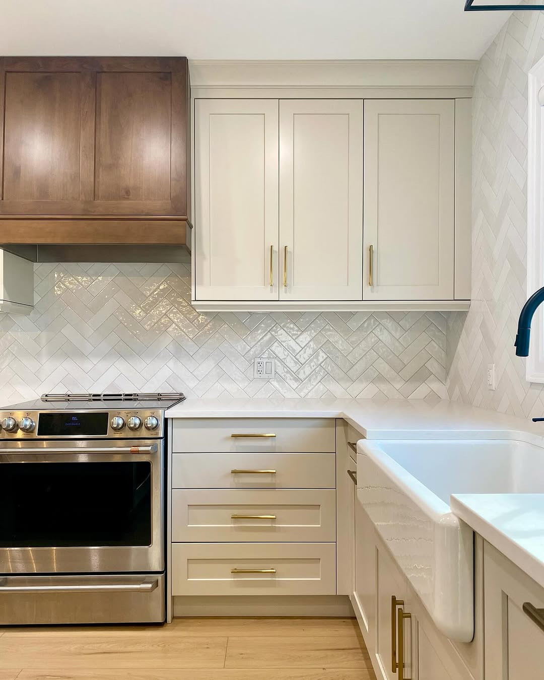
A white subway herringbone backsplash gives you a timeless look with more energy than a standard brick layout. You still get that clean, fresh kitchen feel, but the angled pattern brings a sense of motion that keeps the wall from looking flat. If you want something safe that still feels special, this is often the first idea I would look at.
Why this layout always works
The beauty of white subway tile is its range. It works in a bright modern kitchen, a soft farmhouse space, or a room with traditional cabinets and brass hardware. The herringbone layout changes the mood without making the backsplash feel busy, so your counters and cabinets still have room to shine.
A common size for this look is a 3-by-6-inch subway tile. That size keeps the pattern clear and easy to read, which matters in a detailed layout like herringbone. Smaller tiles can feel fussy from a distance, and oversized pieces can make the zigzag less defined.
You also get a lot of freedom with the finish. Glossy tile bounces light around the room and helps a smaller kitchen feel brighter. Matte white tile feels softer and quieter, which can be perfect if you want a more relaxed look.
Grout changes the whole mood
Grout color matters more here than many people expect. Bright white grout creates a crisp, fresh wall where the whole surface reads as one clean plane. Soft gray grout shows off the pattern more clearly, because it traces each tile and gives the herringbone shape extra depth.
If your kitchen already has strong details, like bold stone counters or dark painted cabinets, white grout can keep the backsplash from competing. If the room feels plain and you want the tile pattern to stand out, gray grout gives you that extra definition. You do not need a dramatic contrast to make it work. Even a light misty gray can sharpen the design.
The placement detail people miss
The biggest mistake with this style often happens behind the range. If the center line is off, the whole backsplash can look slightly awkward, even when the tile itself is beautiful. Your eye goes straight to the focal wall, so any shift in the pattern becomes obvious there.
Start by marking the visual center before a single tile goes up. Then dry-lay a few rows to see where the points land around the hood, window, or shelves. I have seen simple white tile look expensive just because the alignment was done well. In a pattern this classic, precision does much of the work.
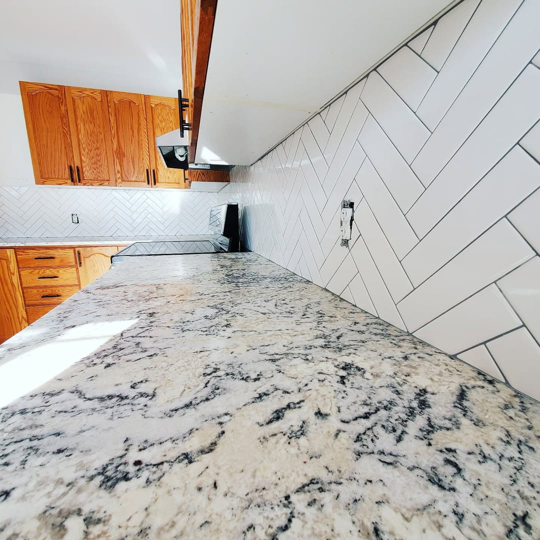
Credit to @k2otiling
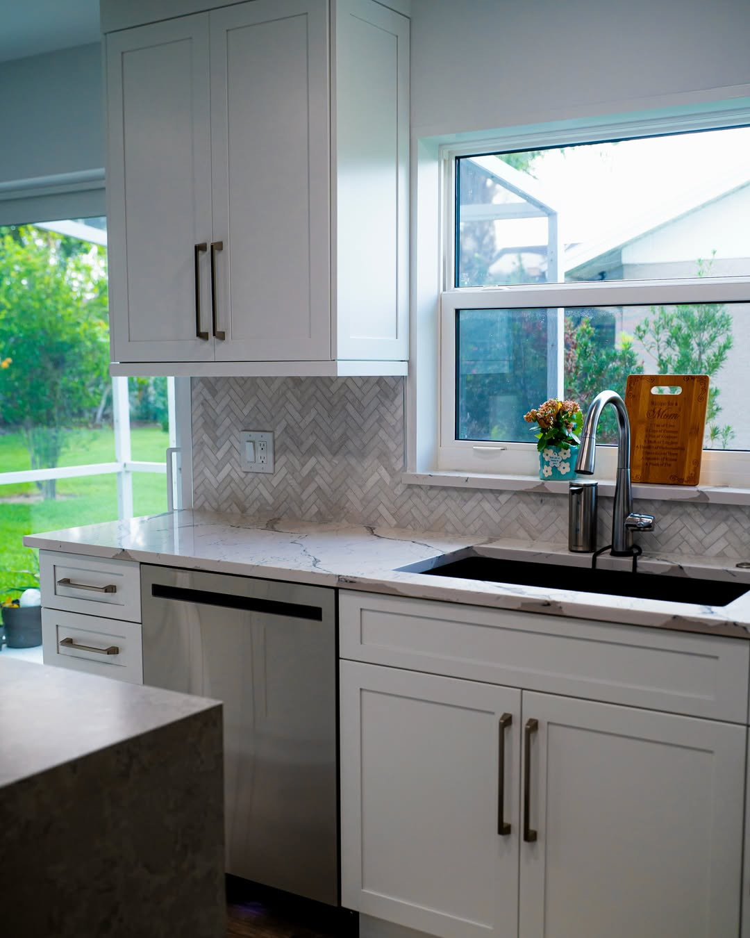
2. Marble Herringbone With Soft Veining
If you want your kitchen to feel softer and more refined, marble herringbone can do that fast. It brings movement through both the pattern and the natural veining, which gives the wall more life than a flat solid color. Used with care, it feels graceful rather than flashy.
A quieter kind of luxury
Marble herringbone works best when you let the stone speak in a calm voice. Soft white, pale gray, and gentle taupe veins keep the backsplash rich without making it feel crowded. This is the kind of surface that looks different in morning light, afternoon sun, and under warm pendant lighting at night.
The pattern already has motion built in, so you do not need wild stone variation to create interest. In fact, subtle veining often looks better in a herringbone layout because the wall stays readable. You can enjoy the character of real stone, or choose a marble-look porcelain tile if you want easier care.
Honed or polished?
The finish changes the feeling of the room. Honed marble has a soft, velvety surface that feels relaxed and understated. Polished marble reflects more light and looks dressier, which can be beautiful in a kitchen with sleek cabinets or formal details.
I usually think about the rest of the room before choosing. If you have shiny hardware, glossy cabinets, or a bright open layout, honed marble can balance those harder surfaces. If the kitchen has flat paint, warm wood, and muted colors, polished marble may add the sparkle that the room needs.
Marble does ask for some care. Sealing helps protect it from splashes and cooking mess, especially behind the range and near the sink. That step is simple, but you do need to plan for it if you choose real stone.
Where stronger veining looks best
Dramatic veining can be stunning, but placement matters. It usually works best on a main focal wall, such as behind the range, where you want the backsplash to act almost like art. Spreading a loud stone across every wall can make the kitchen feel restless, especially once dishes, utensils, and small appliances come back out.
If you love the bolder look, keep other finishes quieter. Simple cabinet fronts, plain counters, and a restrained paint color will give the backsplash room to breathe. That balance helps the herringbone pattern stay elegant instead of chaotic.
For many kitchens, the sweet spot is marble with soft movement and just enough contrast to catch the eye. You see detail up close, but from across the room, the wall still feels smooth and composed.
Credit to @imexstone
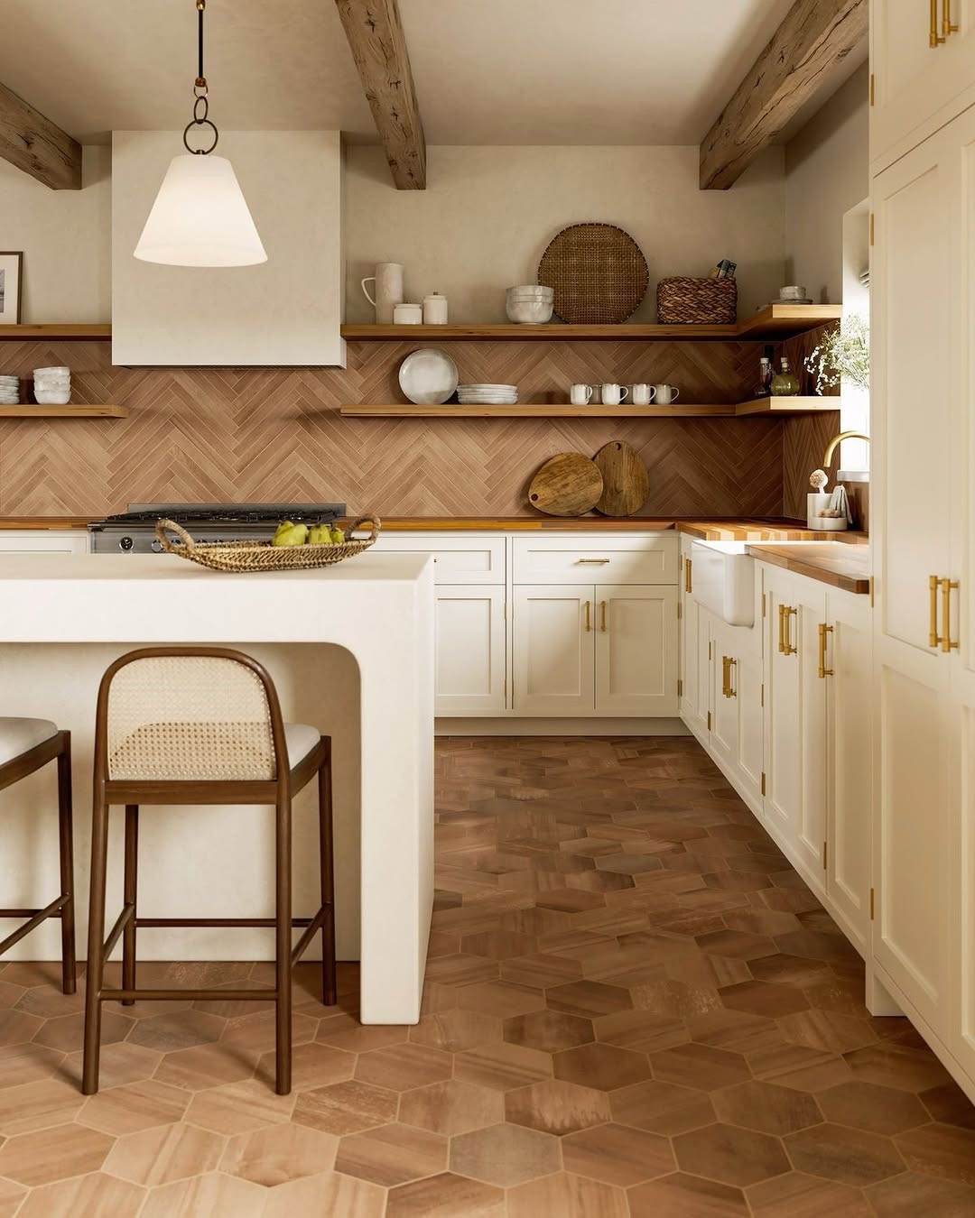
3. Warm Wood-Look Tile Pattern
A wood-look herringbone backsplash adds warmth in a way that surprises people. It softens a kitchen full of hard surfaces and brings in a natural tone without the upkeep of real wood near water and heat. If your space feels cold, this idea can shift the mood almost at once.
The warmth factor
Wood-look tile gives you the color and grain of timber with the strength of porcelain. In a herringbone pattern, those longer lines feel tailored and fresh, especially when you use plank-style tiles. The result can lean rustic, modern, or Scandinavian depending on the stain tone and the rest of the room.
Light oak shades make a kitchen feel airy and calm. Mid-tone walnut colors bring more depth and contrast, which can be striking against white walls or cream cabinets. Darker wood looks richer, but it usually needs enough natural or overhead light so the backsplash does not disappear.
Best pairings in the room
This look pairs especially well with oak cabinets because the tones feel layered instead of matched. You get warmth on warmth, but the tile pattern keeps the wall interesting. Black hardware is another smart partner, since it adds a crisp edge and helps the backsplash feel more current.
White quartz counters, matte black faucets, and simple open shelving can all sit comfortably beside this kind of tile. I also like it in kitchens that need a little softness after a full renovation. Sometimes the cabinets and counters look great, yet the room still feels hard. A wood-look backsplash can fix that.
The clash to avoid
The one issue to watch closely is the faux grain. If the backsplash has a yellow, red, or gray undertone that fights with your real wood floor nearby, the whole kitchen can feel off. You may not know why at first, but your eye will sense that the tones do not belong together.
Set tile samples next to the flooring before you commit. Look at them in daylight and again at night, because warm bulbs can shift the color more than you expect. Try to choose a backsplash that relates to the floor without copying it exactly. A small difference in tone often looks better than a near match that misses.
Longer plank-style pieces usually give the herringbone pattern a cleaner, more natural rhythm. That shape helps the backsplash feel designed, not gimmicky, and it lets the warm color do its best work.
Credit to @caineandcompany
4. Vertical Herringbone for Extra Height
If your kitchen feels boxed in by upper cabinets or low ceilings, changing the tile direction can make a real difference. A vertical herringbone layout draws the eye up the wall, which makes the room feel taller and lighter. It is a smart trick, but it still looks beautiful in its own right.
Why the upward pattern helps
Vertical herringbone takes the classic zigzag and rotates it so the movement rises instead of spreading sideways. That simple shift changes how you read the room. Walls seem higher, windows feel more prominent, and the backsplash can make tight spaces feel less compressed.
This is especially useful in kitchens with short upper cabinets, soffits, or a low ceiling line. Your eye follows the tile upward, so attention moves away from the squat proportions. In a narrow kitchen, that can bring a welcome sense of lift.
Where it looks best
A window wall is one of the best places for this layout. The upright pattern frames the glass beautifully and helps connect the counter area to the height of the window above. Sunlight also catches the changing angles of the tile, which makes the backsplash feel more alive during the day.
It can also look striking behind a range hood, especially if you carry the tile a little higher than usual. That extra height gives the focal wall more presence. If you stop the tile too low, you lose some of the stretching effect that makes this layout so useful.
The setup step that saves you
The most helpful move before installation is marking a true plumb line on the wall. Because the pattern points upward, even a small drift becomes easy to spot once several rows are in place. A straight guide keeps the layout disciplined from the first tile to the last.
Credit to @backsplashdecor.ca
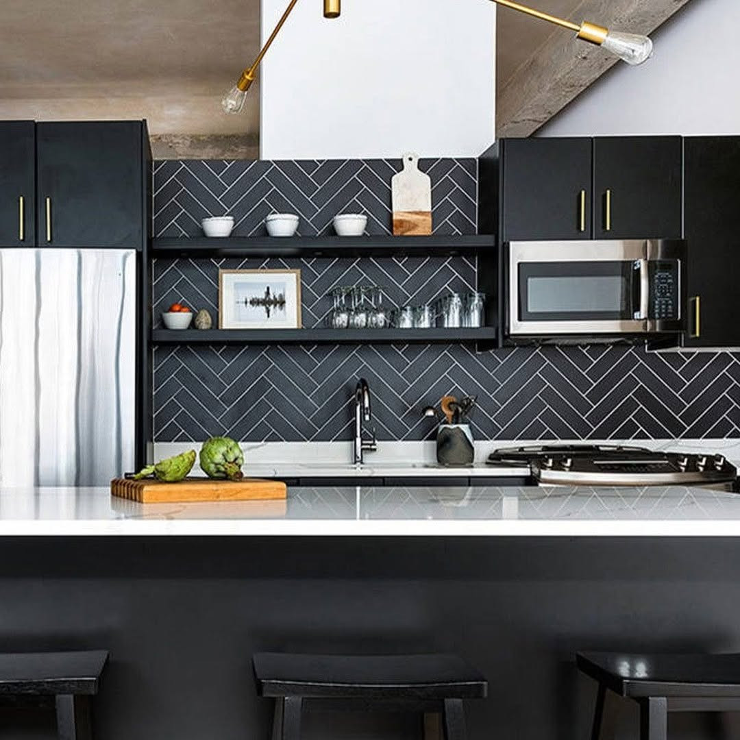
5. Moody Black Tile With Contrast Grout
A black herringbone backsplash gives a kitchen instant drama. It feels sharper than soft white tile, and it brings real depth to a wall that might otherwise fade into the background. If you want your kitchen to look more tailored and a little moodier, this idea does that fast. The grout choice matters just as much as the tile, because it can either trace every angle in the pattern or let the wall read as one dark, rich surface.
Why the contrast changes everything
Black tile with white or pale gray grout makes the herringbone layout stand out right away. Every turn in the pattern becomes more visible, so the backsplash feels graphic and bold. This works well in kitchens with simple cabinets, because the wall becomes the feature without needing busy stone or loud hardware.
If you want a quieter look, charcoal grout softens the effect. You still see the pattern, but it does not jump at you from across the room. I like this option when the kitchen already has strong details, such as statement lights or a striking vent hood, because the backsplash supports the room instead of competing with it.
Matte finishes and real-life use
Matte black ceramic tile looks modern and grounded. It also hides some glare, which helps the wall feel richer and less shiny. In a bright kitchen, that can be a smart balance, especially if you already have glossy counters or polished metal finishes that bounce a lot of light around the room.
Still, dark tile has a tradeoff near the cooktop. Oil spots, pale dust, and dried splatter can show up faster than you expect, especially on flat black surfaces. That does not mean you should skip it. It just means you should know where you are using it and be ready to wipe that area down often.
Where this style works best
This look shines in kitchens with white oak cabinets, crisp white cabinets, or even deep green lowers. The contrast feels clean and current. It can also help a basic kitchen look more custom, since herringbone already adds movement and the dark color gives that movement more force.
I would be careful with very busy countertops here. If your stone already has heavy movement, strong black tile plus contrast grout can push the room too far. Keep one surface calm, and the backsplash will feel strong for the right reason.
A detail worth planning early
Think about your outlet covers before tile goes up. Standard bright white covers can look harsh against a dark backsplash and break the pattern in a distracting way. Paintable covers or black covers usually blend better, and that small move keeps the wall looking cleaner and more finished.
Credit to @backsplashideas
6. Zellige-Inspired Texture in Herringbone
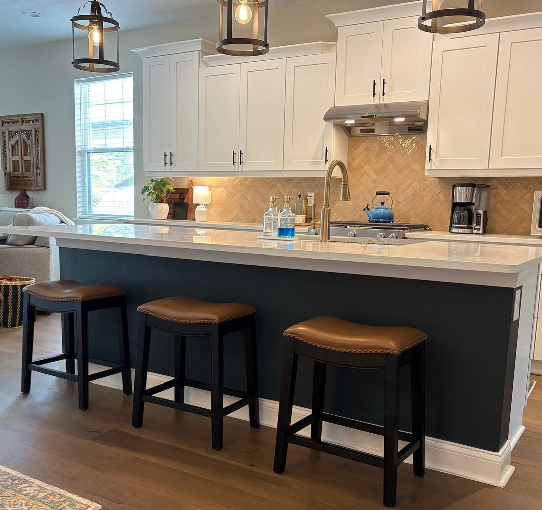
Zellige-inspired herringbone brings movement in a softer, more handmade way. You still get the strong layout of herringbone, but the uneven edges and light-catching glaze make it feel less strict and more lived in. This is the kind of backsplash that changes through the day. Morning light hits it one way, and evening light gives it a different mood.
The beauty of slight variation
What makes this style special is the imperfect surface. Some tiles look a little deeper in color, some catch more shine, and some edges sit just a touch uneven. In a herringbone pattern, that variation keeps the wall from feeling flat. It looks crafted, not stamped out.
You may open a box and notice color shifts right away. That is normal with zellige or zellige-look tile. One tile may lean creamy, another may feel a bit smoky, and another may reflect more light. Mixed together, those small changes give your kitchen warmth and depth that plain uniform tile cannot match.
Spacing needs a lighter touch
This tile style often needs a different mindset during installation. Tiny spacing changes can happen because the edges are not perfectly identical, and that is part of the charm. You do not want to force every line to look machine perfect, because then the handmade look starts to disappear.
I think this style works best when the installer respects the variation instead of fighting it. Herringbone already asks for precision in layout, so the goal is balance. You want the pattern to stay clear, but you also want the texture to stay relaxed and natural.
What to pair, and what to skip
Keep the rest of the kitchen fairly calm if you choose this backsplash. Simple counters let the tile do its job. Soft solid quartz, plain soapstone, or a quiet slab with very little movement usually looks better than heavily patterned stone.
I would avoid pairing this texture with counters that already have loud veining or lots of color change. The eye does not know where to land, and the room can start to feel crowded. This backsplash has enough personality on its own, especially once the glaze starts reflecting light.
A small choice with a big effect
Pick a grout color that sits close to the middle tone of the tile mix. That keeps the wall from looking chopped up and helps the natural shifts read as one surface. If the grout is too bright or too dark, it can pull attention away from the glazed texture, which is the real reason to choose this look.
Credit to @cementtileshop
7. Slim Brick Tiles for Finer Detail
Slim brick tiles make a herringbone backsplash feel more detailed and more custom. Because each piece is narrow, the pattern looks tighter and more refined than it does with standard subway sizes. You get more lines, more direction, and a layout that feels almost tailored to the wall. It is a strong choice if you like clean design but still want visual interest.
Why thinner tiles feel dressier
Pencil-thin or narrow brick tiles create a finer pattern. The herringbone turns look smaller and more frequent, so the backsplash gains texture without relying on bold color. In many kitchens, that makes the whole wall look more finished, almost like trim work made from tile.
This can be especially effective in smaller kitchens. Larger herringbone tiles sometimes feel heavy on a compact wall, but slim pieces keep the pattern light. You still notice it, yet it does not take over the room.
The extra work behind the look
There is a reason this style looks polished. It usually takes more cuts, especially around outlets, under cabinets, and near windows. Each narrow tile has to stay lined up, or the pattern can start to drift by the time it reaches the far end of the wall.
That is why consistent spacing matters so much here. If the joints widen and narrow from one section to the next, the clean effect falls apart. I always notice this first on slim tile installations, because narrow pieces make uneven spacing easier to see.
You should also expect the install to move more slowly. There are simply more pieces to place. The result can be worth it, though, because the backsplash feels sharper and more thought through than a basic layout.
Best settings for this pattern
Use this style when your kitchen leans simple and modern, or when you want to sharpen a softer design. It pairs well with flat-front cabinets, slim hardware, and quiet counters. It also works nicely in transitional kitchens where you want a classic pattern with a cleaner edge.
If the room already has ornate details, carved hood trim, or very busy stone, this fine pattern may get lost. In that case, a larger tile often reads better from a distance. Slim brick herringbone is strongest when you can really see the precision.
A layout move that saves headaches
Dry-fit a full section before setting the first tiles in mortar. That lets you check how the points hit outlets and corners, and it can save you from awkward slivers later. A careful starting point makes the whole backsplash look straighter, and with slim brick tile, that matters more than ever.
8. Full-Height Herringbone Behind Shelves
Taking a full-height herringbone backsplash from countertop to ceiling changes the whole feel of a kitchen wall. It looks more finished, more intentional, and far more architectural than stopping at the usual backsplash line. This idea works especially well behind floating shelves, where the tile becomes a full backdrop instead of a short strip between the counter and cabinets.
Why going higher feels richer
A standard backsplash does the job, but a full wall of herringbone creates a focal point. Your eye travels up, which makes the kitchen feel taller and more complete. The pattern gets room to breathe, and you can appreciate the movement in a way that is harder to see on a shorter section of wall.
This approach also helps open shelving look more grounded. Without tile behind them, shelves can sometimes seem like they are floating in empty space. With herringbone running all the way up, the shelves feel anchored and the whole wall reads as one design choice.
Planning around brackets and spacing
If you are adding floating shelves, plan the shelf brackets before the tile install starts. This matters. The cuts around hidden supports or wall anchors should be mapped out early so the pattern does not end up broken in awkward places.
I would also think about shelf spacing with your tile layout in mind. If a bracket lands right where several angled cuts meet, installation gets harder and the finished look may feel busier than you want. A small shift in shelf height can make the tile work look much cleaner.
Comparing cabinet-height tile to ceiling-height tile
Stopping tile at cabinet height is common, and it can look neat and practical. Still, the line where the tile ends can sometimes feel abrupt, especially if you have open wall above or shelves instead of upper cabinets. Full-height tile solves that by turning the entire section into a feature wall.

Credit to @divineinteriorsdesign.katytx
9. Two-Tone Herringbone Color Blend
A two-tone herringbone backsplash mixes two tile colors in one pattern for a look that feels layered and custom. You still get the movement of herringbone, but the color shift adds even more depth across the wall.
Why the mix works
Some Herringbone Backsplash Ideas feel quiet and classic. This one has a little more personality. By pairing two close shades, such as cream and sage or greige and white, you can soften the pattern or make it stand out more, depending on how much contrast you choose.
I like this option in kitchens that already feel simple. Flat cabinet fronts, plain counters, and open wall space give the color blend room to show off. You are not adding a loud print. You are adding gentle variation that keeps the backsplash from looking flat.
Where it looks best
This idea works best when the two colors relate to the rest of the kitchen. Cream and sage can warm up white cabinets. Greige and white can tie together stainless steel, stone counters, and painted wood. If your kitchen already has strong movement in the counters, flooring, and lighting, keep the tile colors close so the wall does not start to compete.
Placement matters too. A two-tone blend looks especially good on one clear stretch of wall, like the run behind a range or a sink wall with few upper cabinets. In a broken-up layout with many outlets, corners, and cabinet cuts, the color story can get harder to read.
Dry-lay first, always
The smartest move is to dry-lay your tile before anything goes on the wall. Set out several rows on the floor or a large board, then shift the colors until the pattern looks balanced. That step helps you catch clumps of one shade before installation starts.
The main mistake is using too many shades. Once you move past two, the clean herringbone shape starts to fade. Keep the palette tight, let the angled layout do the work, and your kitchen will feel thoughtful instead of busy.

Credit to @fairfaxkitchenbath
10. Large-Format Pieces With Fewer Seams
Large-format herringbone uses oversized rectangular tiles to create a cleaner wall with fewer grout lines. The pattern still feels detailed, yet the overall effect is calmer and more modern.
A cleaner take on herringbone
If you love herringbone but do not want a busy backsplash, this version hits the sweet spot. Longer tiles stretch the pattern out, so your eye reads the shape first instead of stopping at every grout joint. That makes the wall look smoother from across the room.
There is also a practical side. Fewer seams mean fewer little grooves where grease and dust can settle. In a hardworking kitchen, that matters more than people think.
Big rectangles versus small bricks
Small brick tiles give you a tighter, more detailed herringbone. They feel a bit dressier and more intricate. Large-format pieces feel broader and quieter, which suits kitchens with slab cabinet doors, waterfall counters, or a simple open-plan layout.
You can also use this style to make a compact kitchen feel less chopped up. Because there are fewer visual breaks, the wall reads as one stronger surface. That simple shift can make the room seem more settled and less crowded.
Where this idea shines
This backsplash works well if you want pattern without fuss. It fits beautifully in modern kitchens, transitional spaces, and homes where the counters already have a lot to say. If your stone has bold veining or your hardware has a sculptural look, a bigger tile can keep the balance right.
I would skip it only if you want a very delicate, handmade feel. Chunky rectangles carry more weight, so the final look is bolder and more structured.
The cut that matters most
One thing can make or break this layout: the diagonal cuts. Longer tiles are less forgiving, and uneven edges show fast in a herringbone pattern. A tile saw helps you get crisp, neat ends, especially around outlets, window trim, and the edge under cabinets.
Before installation starts, ask for a layout plan that shows where the cut tiles will land. You want those cuts to look intentional, not squeezed in at the end. A little planning keeps this cleaner style looking sharp.
11. Metallic Glaze for Light Reflection
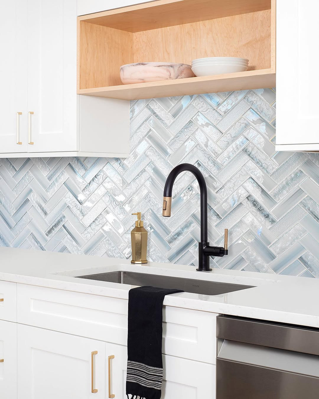
A metallic glaze herringbone backsplash catches light and gives the kitchen a more decorative finish. In the right room, it can brighten the wall and make the pattern feel almost like jewelry for the space.
Light that moves
This backsplash idea works through reflection. A brushed bronze, pewter, or silver-gray glaze shifts as daylight changes, so the wall never looks flat. You still see the herringbone pattern, but the sheen gives it extra life.
I like this look most in compact kitchens that need help feeling brighter. If a room has one small window or sits in a darker corner of the house, reflective tile can bounce light around better than a matte finish. That effect feels subtle from a distance, yet you notice it every time you walk in.
Best place to use it
You do not need to cover every wall to make this work. A metallic herringbone backsplash often looks strongest behind the range or along one main counter run where the light can hit it. In a very large kitchen, too much shimmer can start to feel cold.
This finish also pairs well with simple cabinets. White, mushroom, charcoal, and soft wood tones help the tile stand out without fighting it. If your cabinets already have a glossy finish, pause and step back before adding another reflective layer.
Keep the shine in check
The biggest mistake is mixing this backsplash with too many other shiny surfaces. Mirror-like pendants, polished stone, glossy cabinets, and bright chrome can crowd the room fast. Metallic glaze needs a little breathing room so the light reflection feels rich, not harsh.
Pick one or two supporting finishes and keep the rest quieter. Aged brass hardware or a satin faucet usually sits more comfortably beside this tile than several high-gloss elements all at once.
A smart way to sample
Before you commit, test the tile in morning and evening light. Metallic glazes can shift warmer, cooler, brighter, or softer depending on the hour. That small step helps you choose a finish that adds glow instead of glare.
Credit to @backsplashideas
Conclusion
The best herringbone backsplash does more than fill a wall. It changes how your kitchen feels day to day. A two-tone blend can add quiet color, large-format tile can make cleanup easier, and a metallic glaze can help a small kitchen feel brighter. Pair that with ideas from earlier in the article, like full-height tile for drama or slim brick pieces for extra detail, and you have real range to work with.
Save the ideas that match your kitchen’s light, layout, and style. Then narrow it down to the one that solves the room’s biggest need. That is usually the choice you will love the longest.